Work @ Oracle
Reimagining access management and settings experience for Oracle NetSuite
Work Summary
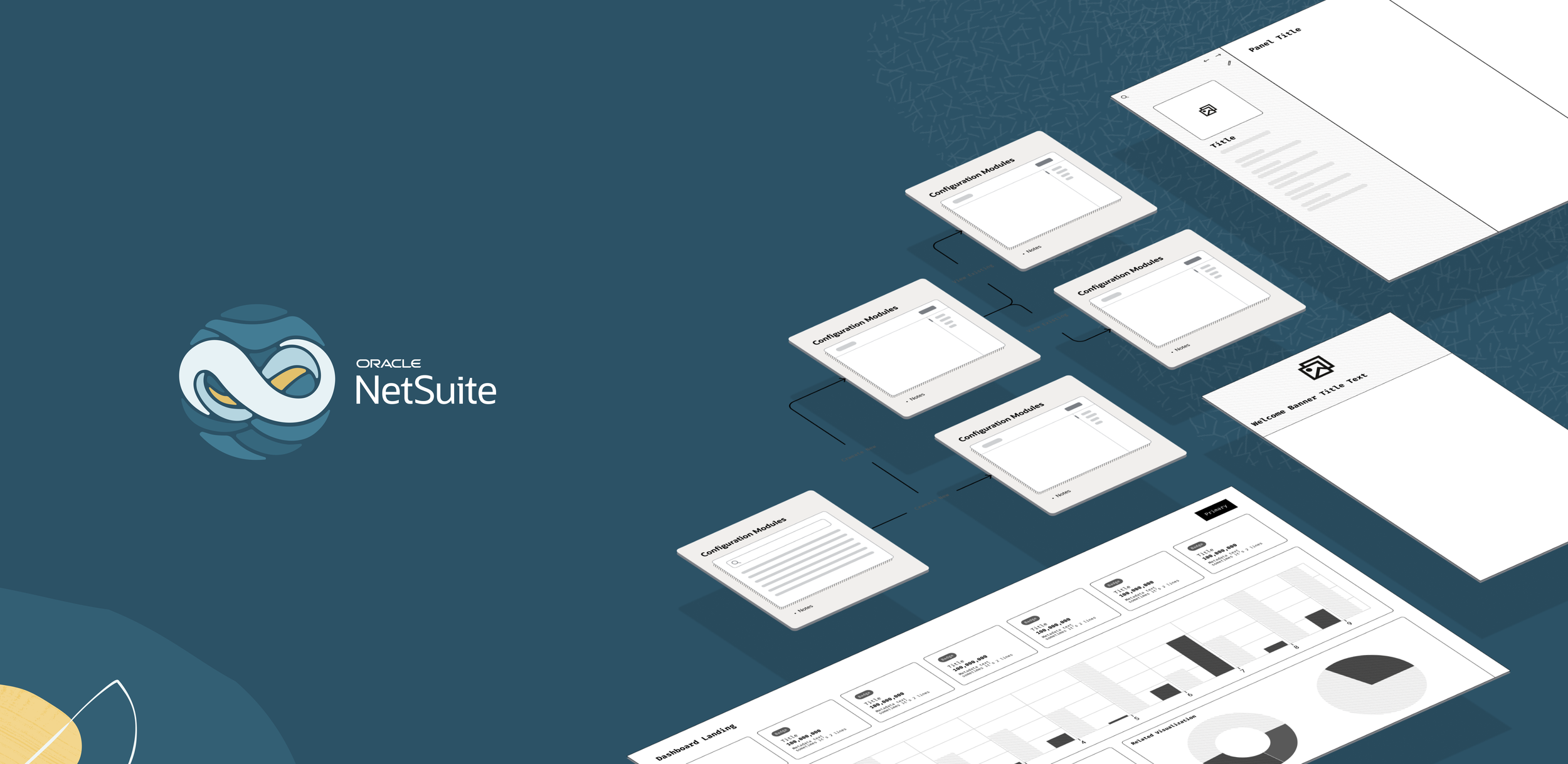
NetSuite is Oracle’s Cloud ERP for small and mid-sized enterprises. It is one unified business management SaaS suite, encompassing ERP/Financials, CRM and e-commerce for more than 37,000 customers.
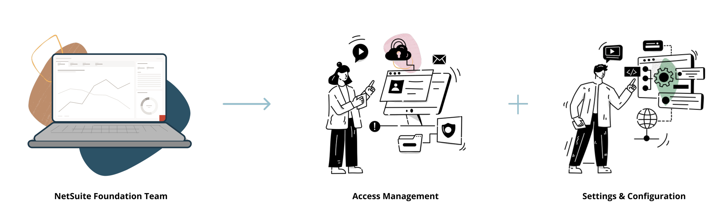
I mainly worked on the next generation of NetSuite on innovating and reimagining the experience of access management and settings across NetSuite utilizing RedWood Design System. I had the opportunity to lead UX projects independently, initiate UX roadmap planning, and refine UX workflows with other stakeholders.
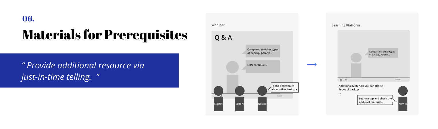
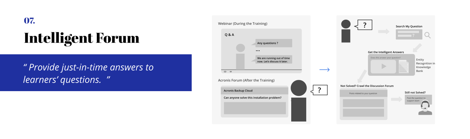
UX Rewards
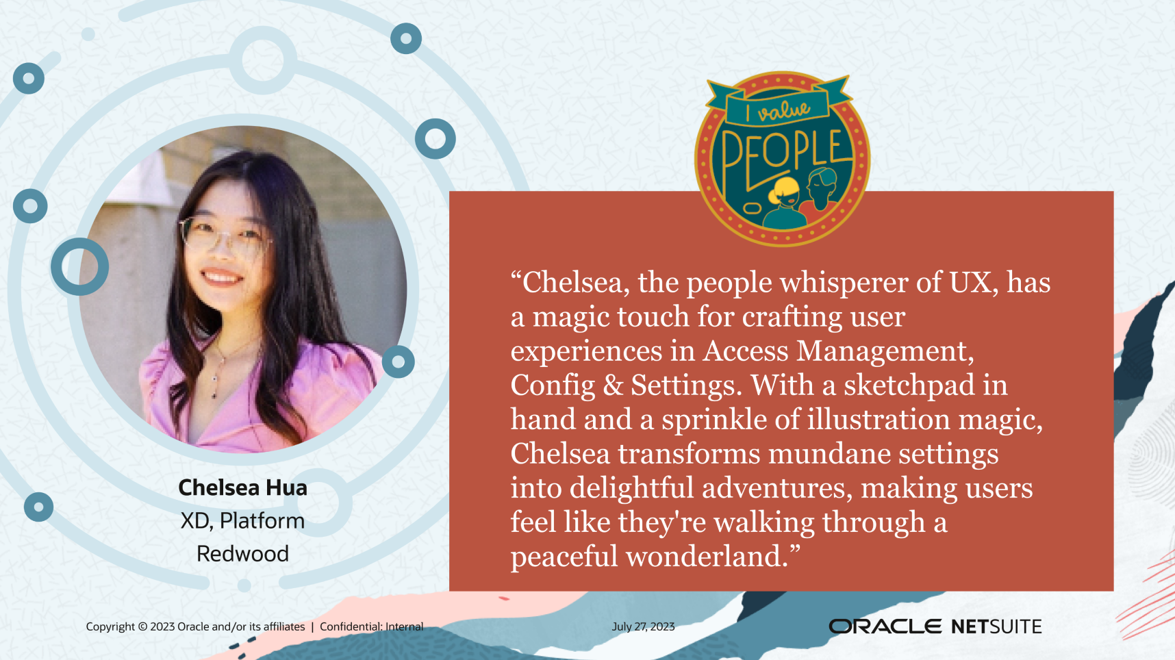
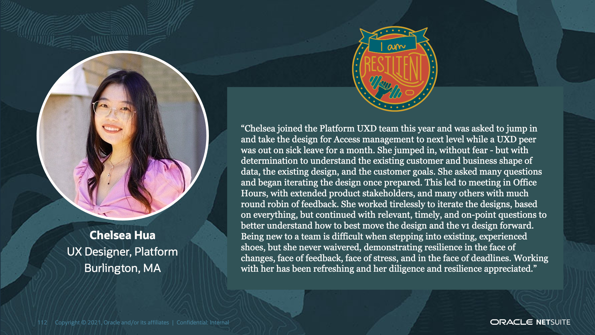
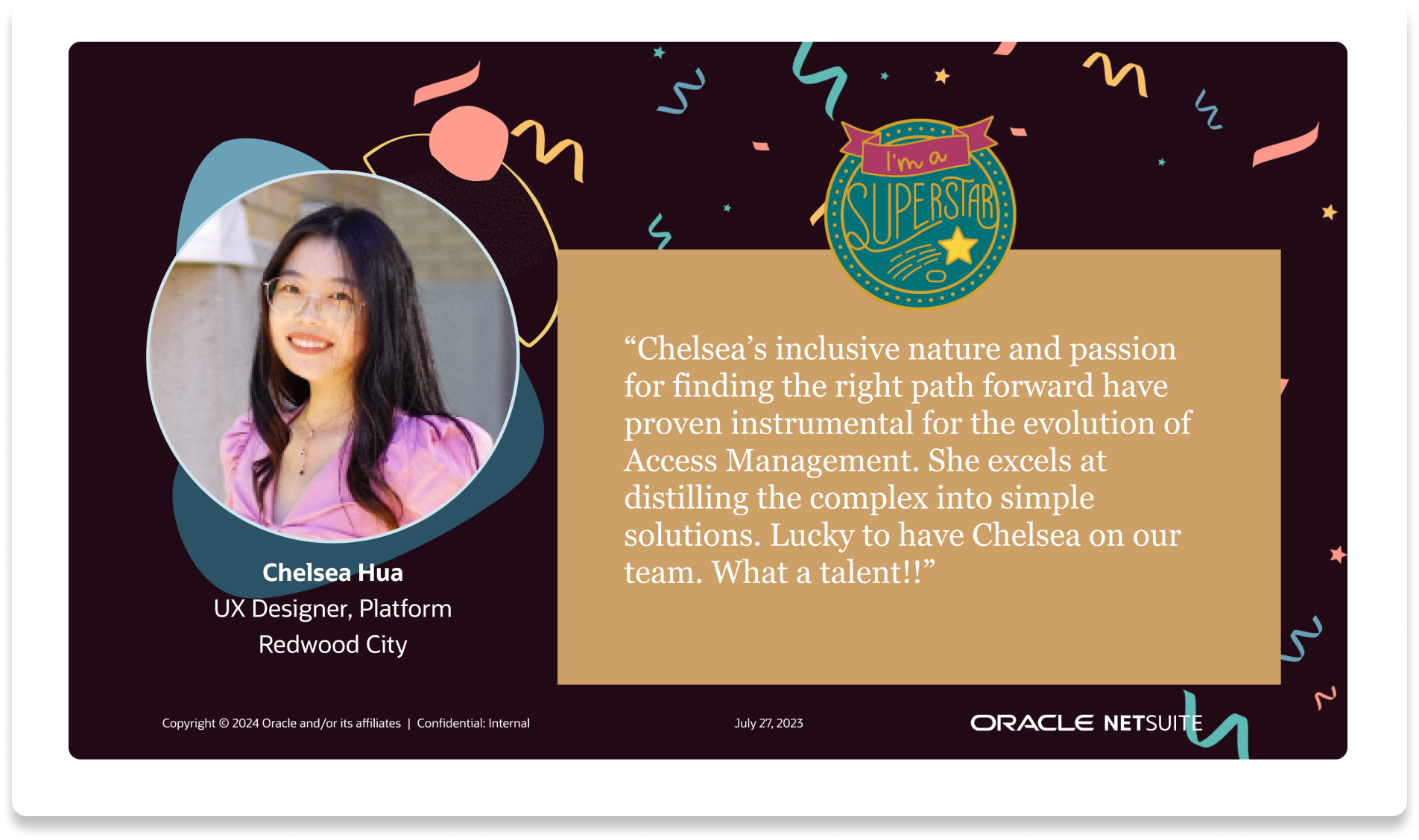
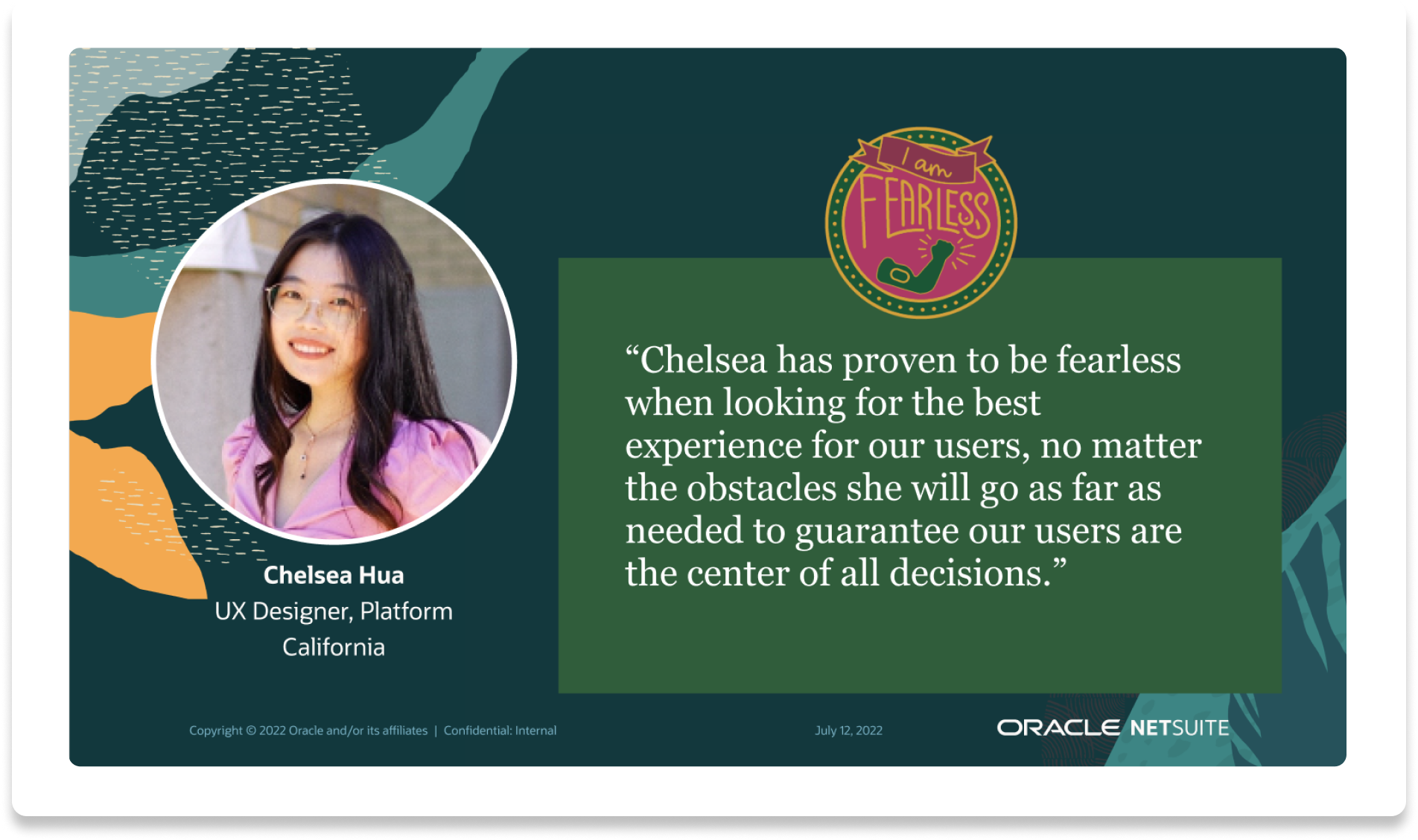
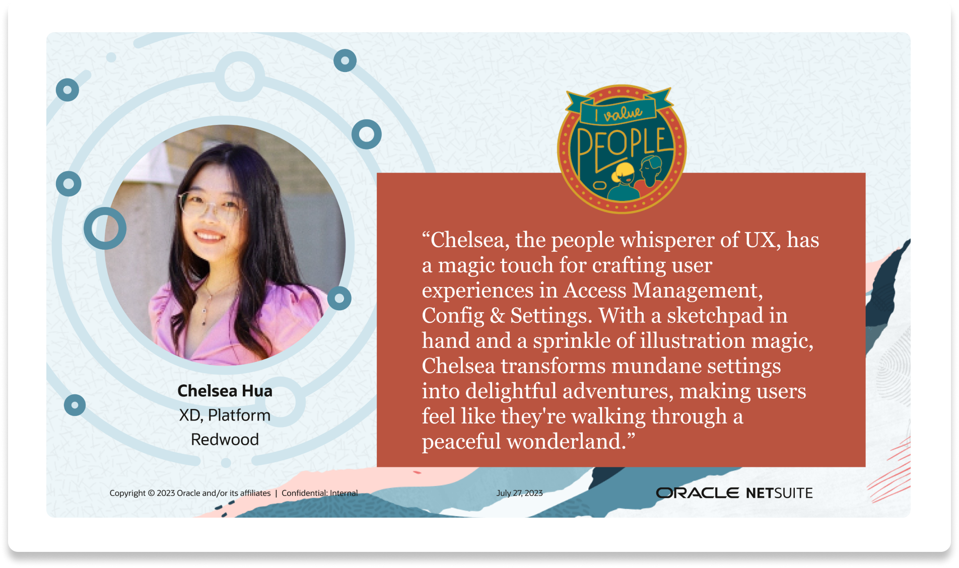
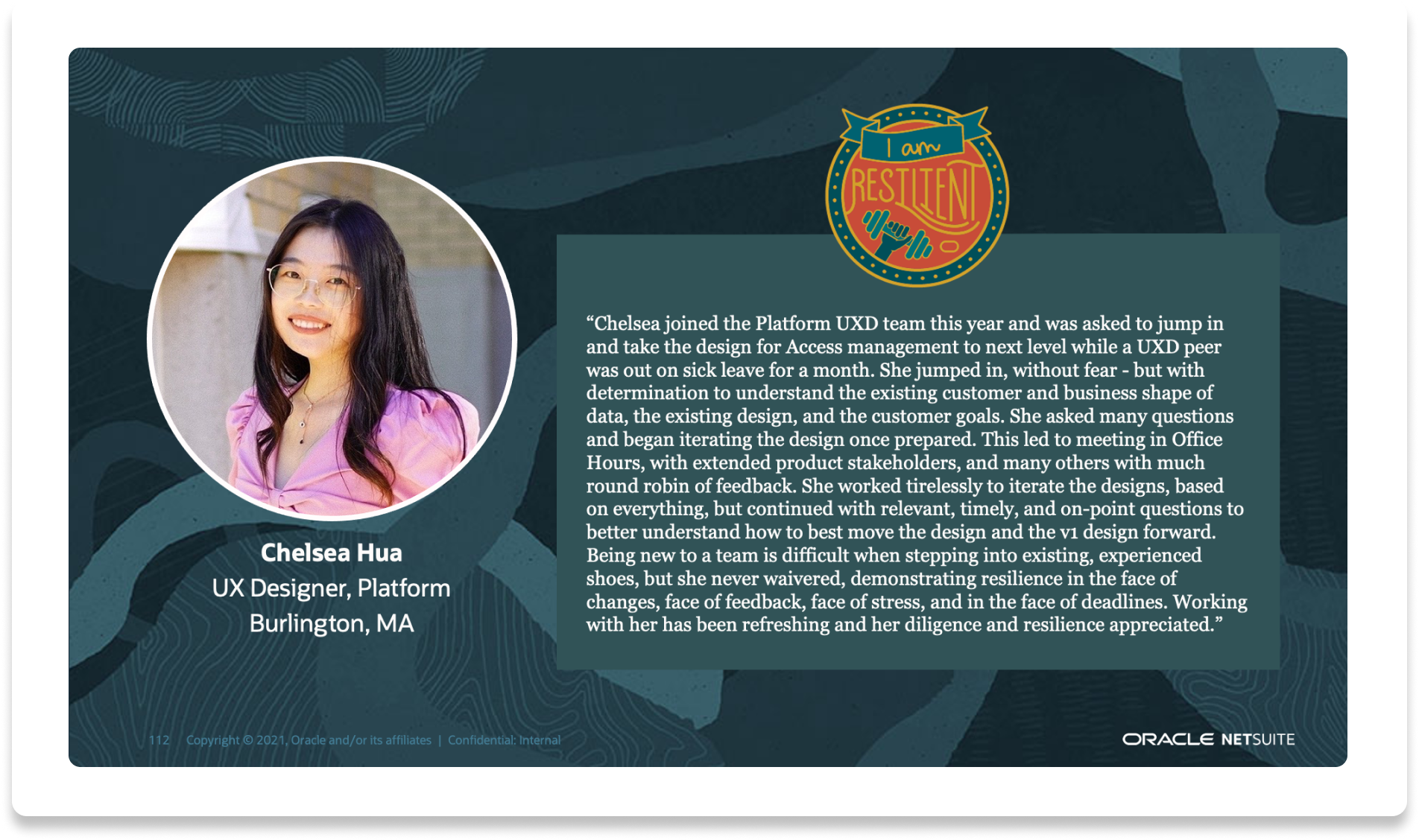
I was nominated for Oracle UX Awards every consecutive year after I joined the company:
Resistant (2021), Fearless(2022), People (2023), Superstar (2024)
01
Challenges
Approach
01. Came up with a completely new access control model, reducing roles to X numbers and permissions to Y numbers.
02. Collaborated with 4 domain teams to ensure the best user flow
03. Advocate for UX and never give up on promoting UX
Impact
01. NetSuite QuickStart Edition launched
02. 90% UX-Lite score
03. Customer quote “...”
Balancing simplicity and flexibility for access control
My most challenging & impactful project as a lead designer
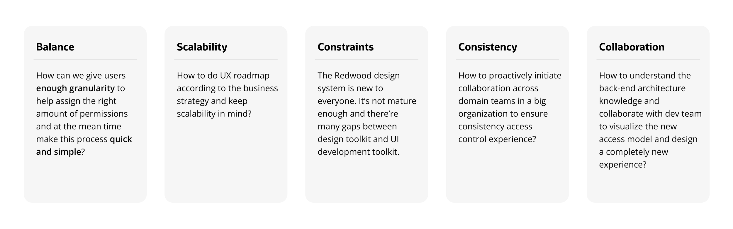
The current flexibility of NetSuite access model comes at a cost of user experience, users have to switch roles very often to accomplish different tasks, and there’re too many steps needed in order to grant access. Currently, there’re over 300 standard roles and 5,000+ permissions, which is too complicated for our new persona. With our new target market, we need to simplify the access control model.

How might we…
give users enough granularity to help assign the right amount of permissions and make this process quick and simple?
Challenges
Approach
01. Came up with a completely new access control model, reducing roles to X numbers and permissions to Y numbers.
02. Collaborated with 4 domain teams to ensure the best user flow
03. Advocate for UX and never give up on promoting UX
Impact
01. NetSuite QuickStart Edition launched
02. 90% UX-Lite score
03. Customer quote “...”
02. Crafting scalable templates in the design system for settings
The current system lacks a standardized configuration experience. Settings are scattered throughout the system.
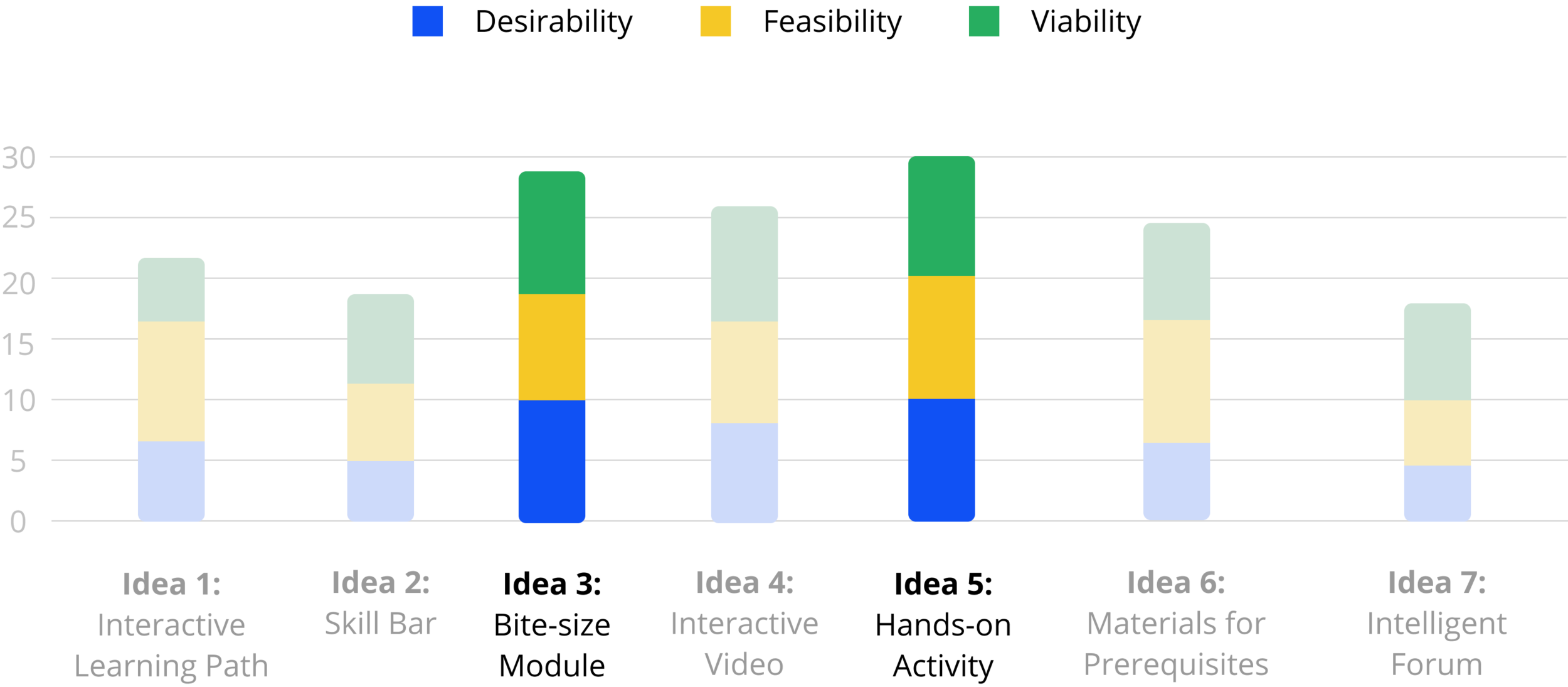
Which ideas should we design?
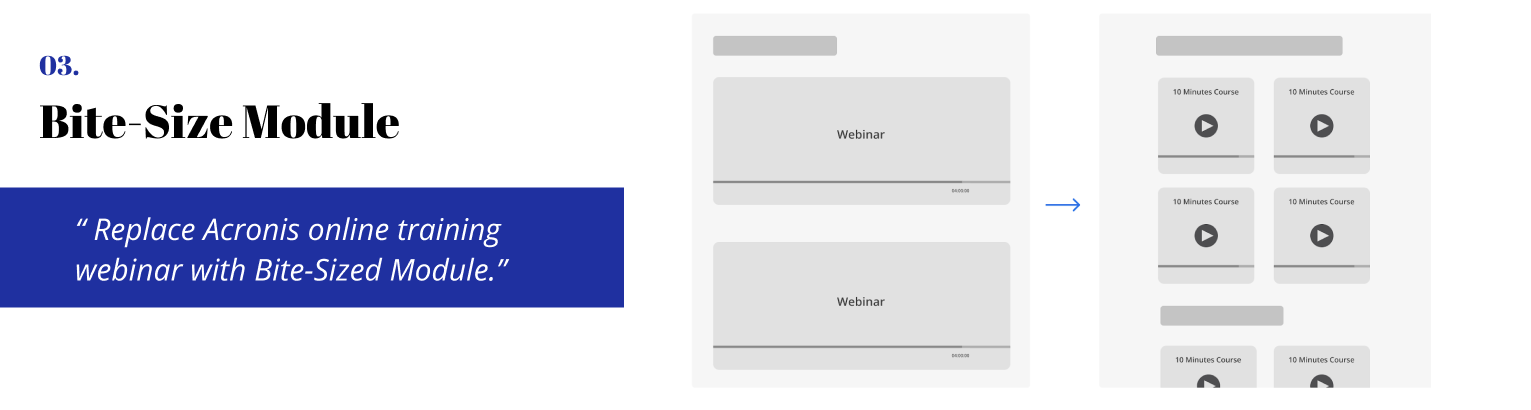
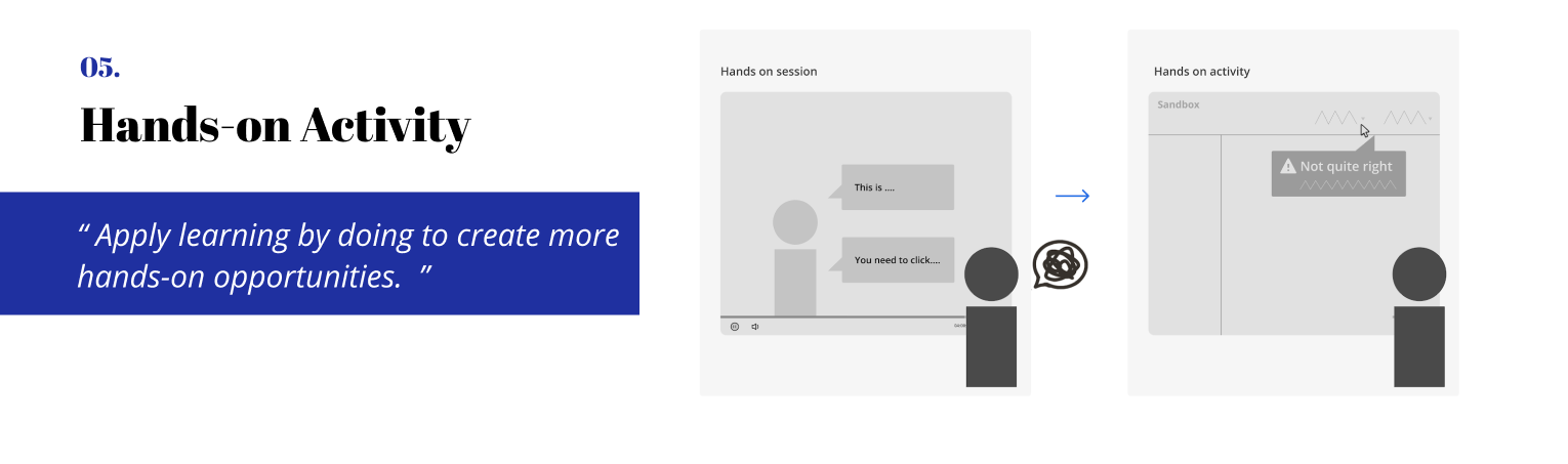
We presented our work to Acronis team (CTO, PM, Trainers, Curriculum Designers, Engineers) remotely in May, and let them help us evaluate our ideas from feasibility and desirability perspectives. By evaluating their feedback and ratings as well as balancing our takeaways, we decided to go with hands-on activity within bite-sized module which can provide learners with an engaging real-work scenario learning experience.
Brainstorm potential features
- Sketches (Parallel Design)
With the parallel design technique, we created an initial design and sketches from the same set of requirements. Each of us worked independently and, when finished, shared our concepts with the group.
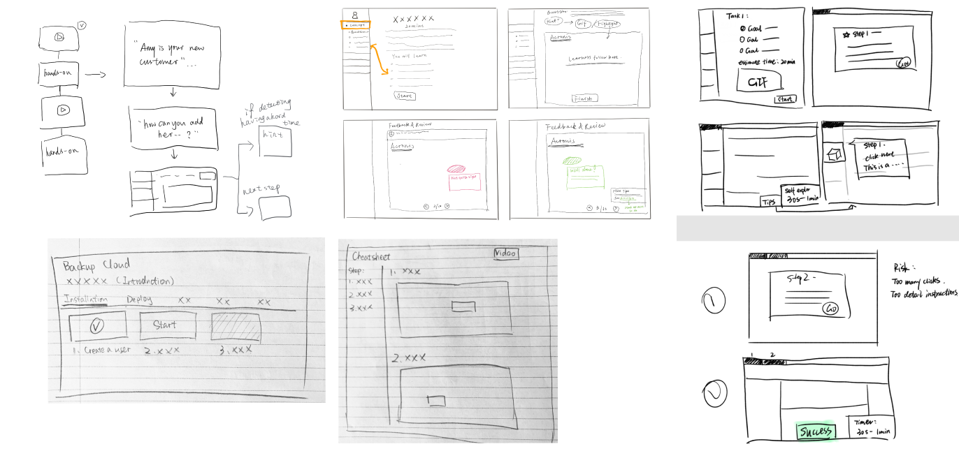
Mid-fi prototyping to test the concept
-Low-fi and Mid-fi Prototyping & A/B Testing
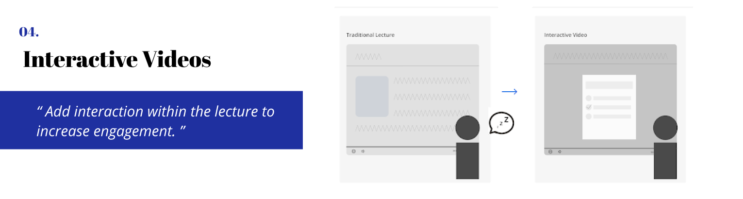
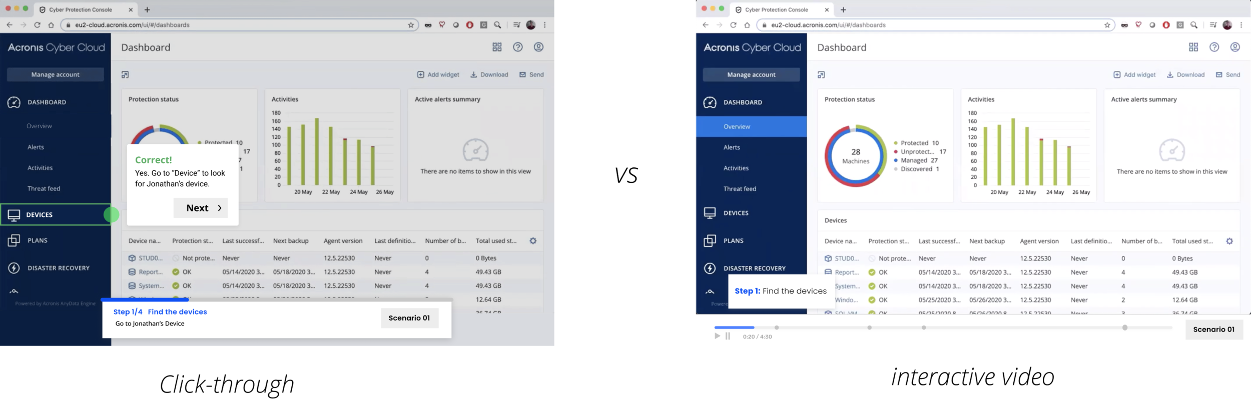
We used the low-fi prototype to gauge the intuitiveness of the user interactions with the interface. We as a team generated two different big directions: click-through training platform vs integrating the lab into the instructional video. We conducted A/B testing and think aloud to see how users interact with different formats.
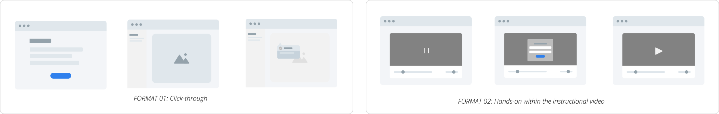
Main Takeaway: novice learners prefer the video while expert learners prefer the click-through
01. Novice learners prefer the interactive video because they think a video can provide more valuable information.
02. Expert learners prefer the click-through as they think watching a video will waste a lot of time if it’s mandatory.
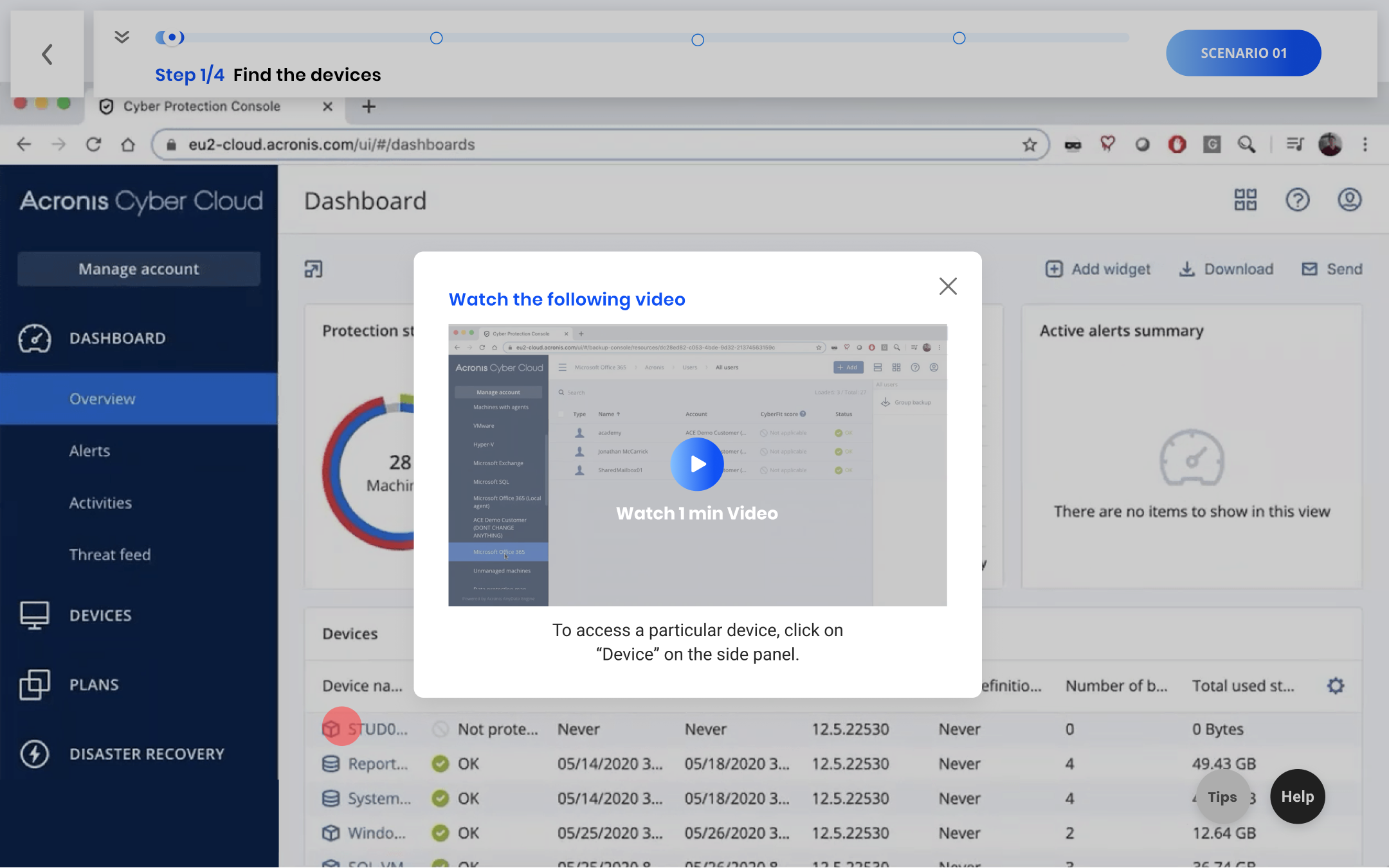
Design Decision 01: Integrate bite-sized videos into the click-through if the learners keep making mistakes for three times
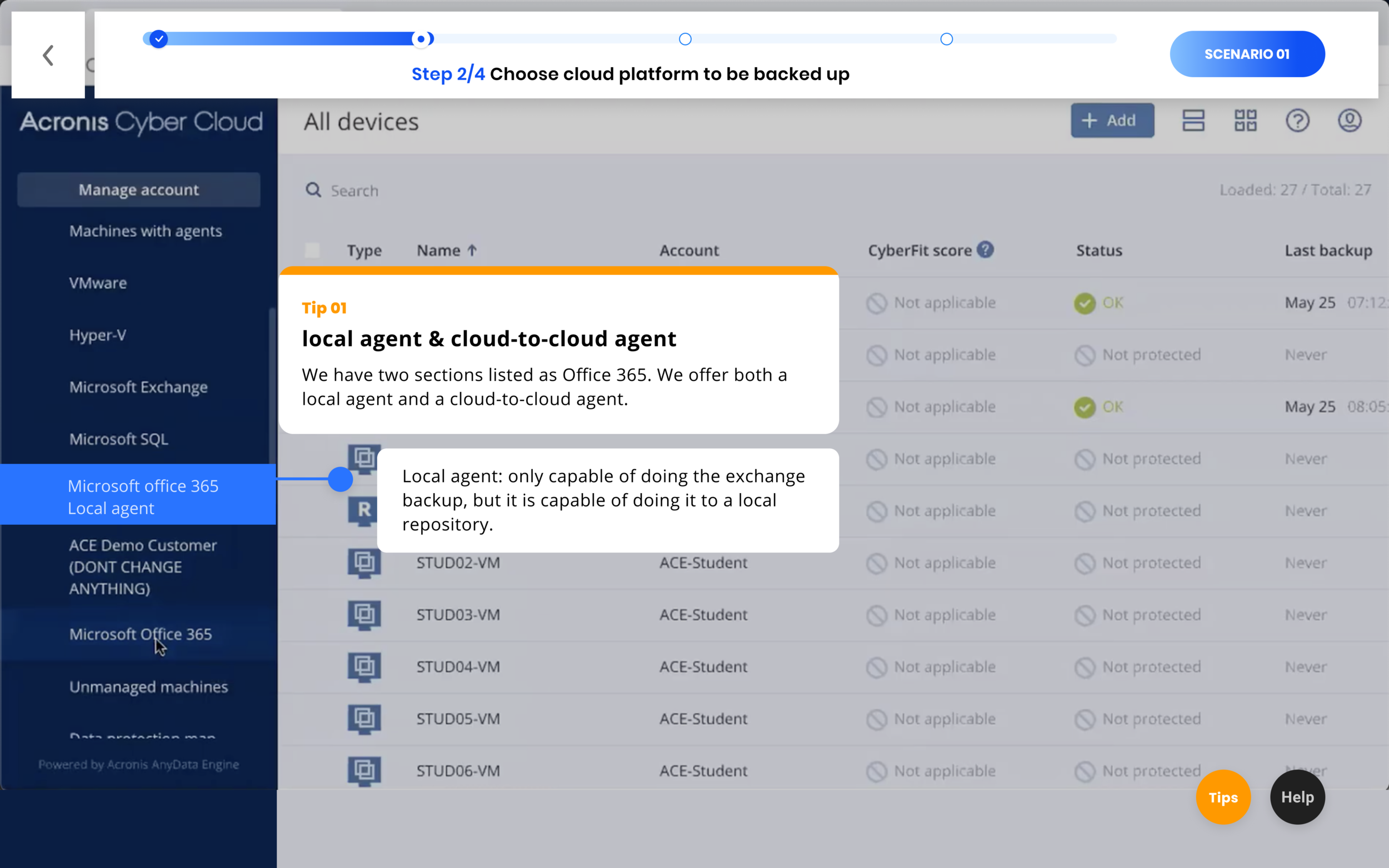
Design Decision 02: Adding tips to convey important conceptual knowledge for a certain step
Visual Design
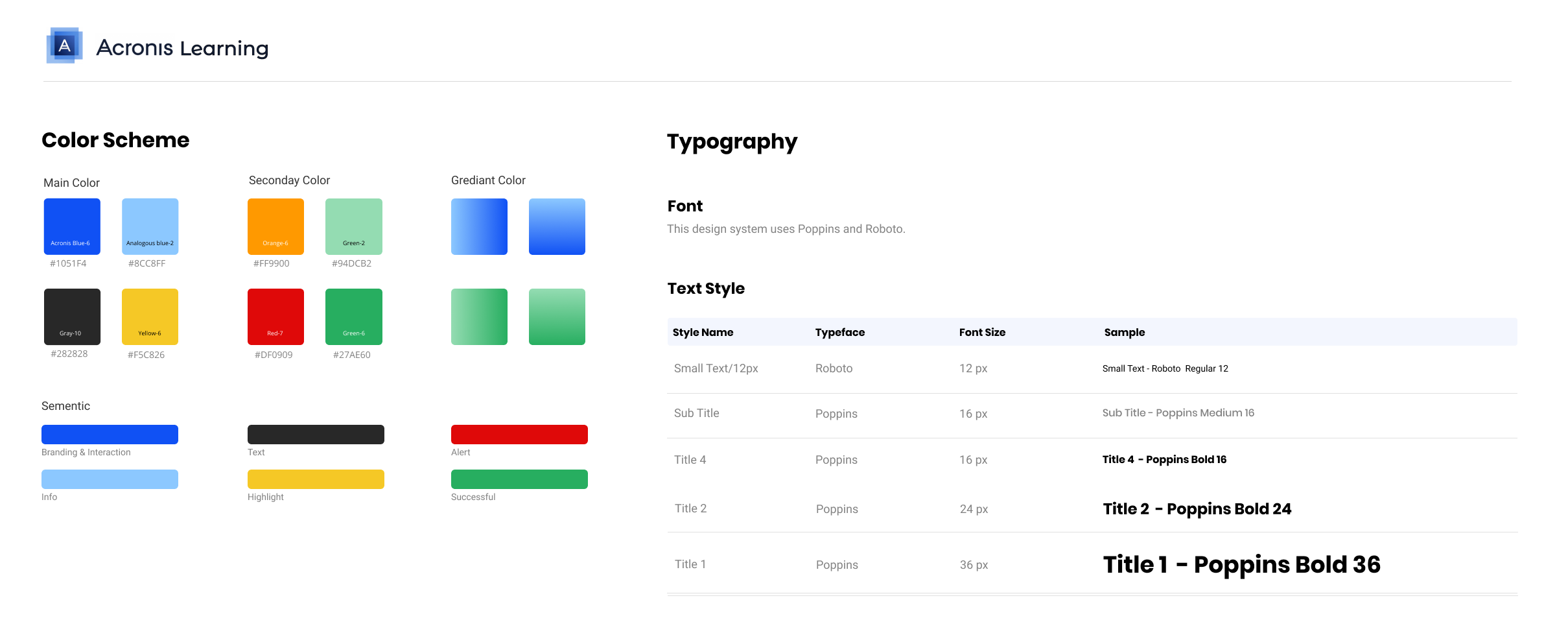
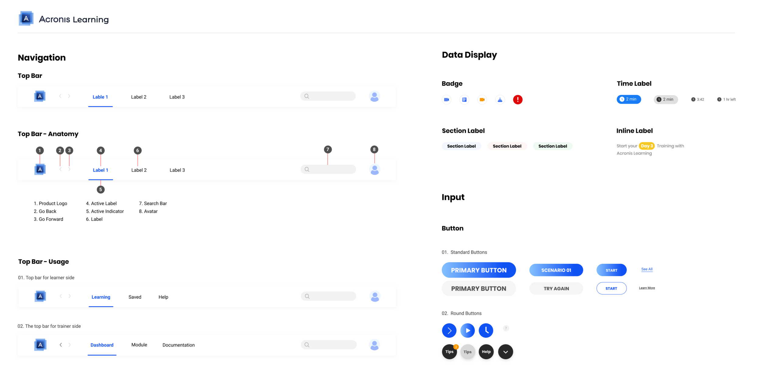
Based on our result for now, we started to consolidate our design into a design system. For the font, we used Poppins as the display type and Roboto as the text type. For the color, we used Acronis blue as the main color to represent branding and interaction; analogous blue to represent the info; yellow to highlight; red to alert; and green to show success.
Main features Iteration
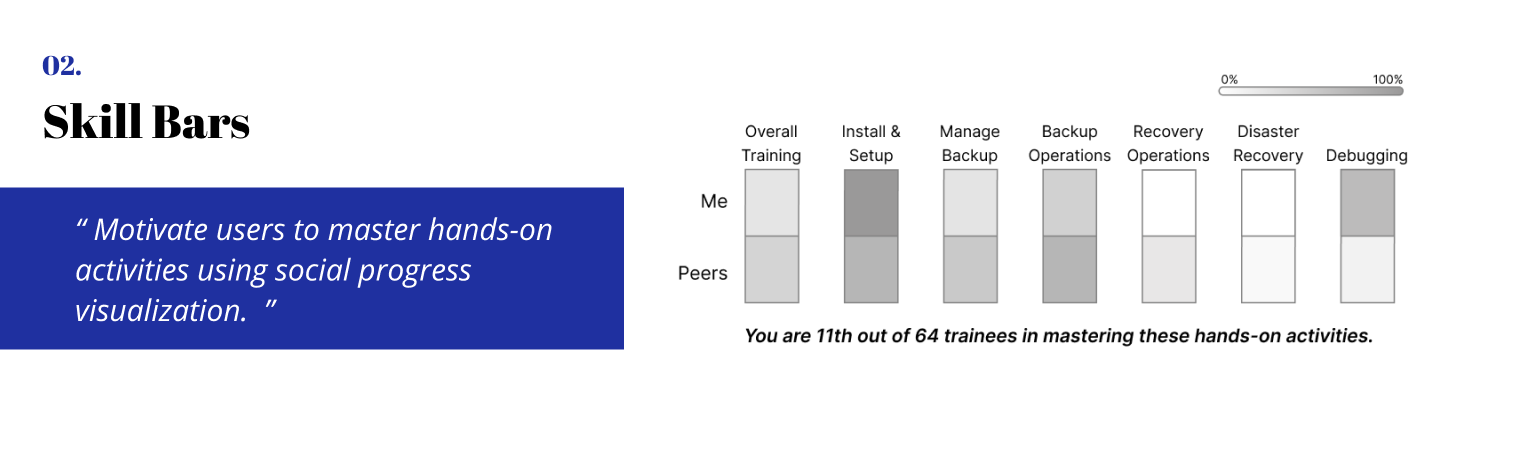
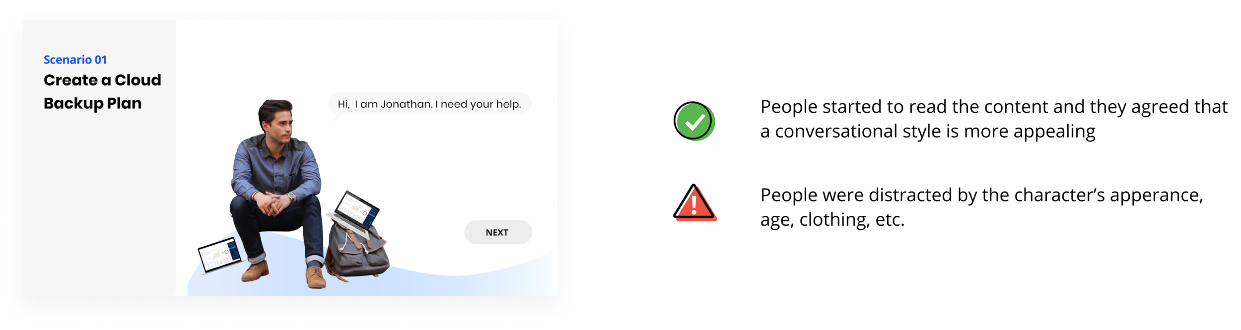
01: Scenario Card Iteration
We aimed to deliver the learning task to learners in real-world scenarios. It aligns with the main goal of learners: they want to apply what they learnt to the real task in their jobs. The real world task, motivates the learning.
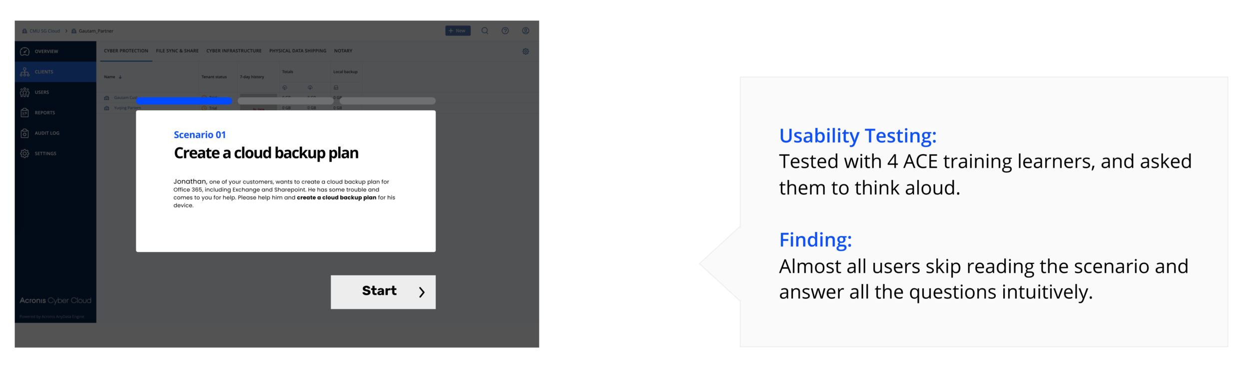
Iteration 1 : A conversational style and a real character
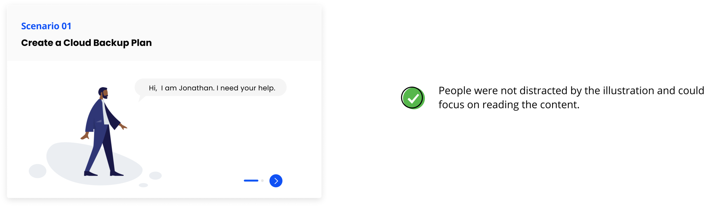
Final Iteration: A conversational style and a flat illustration
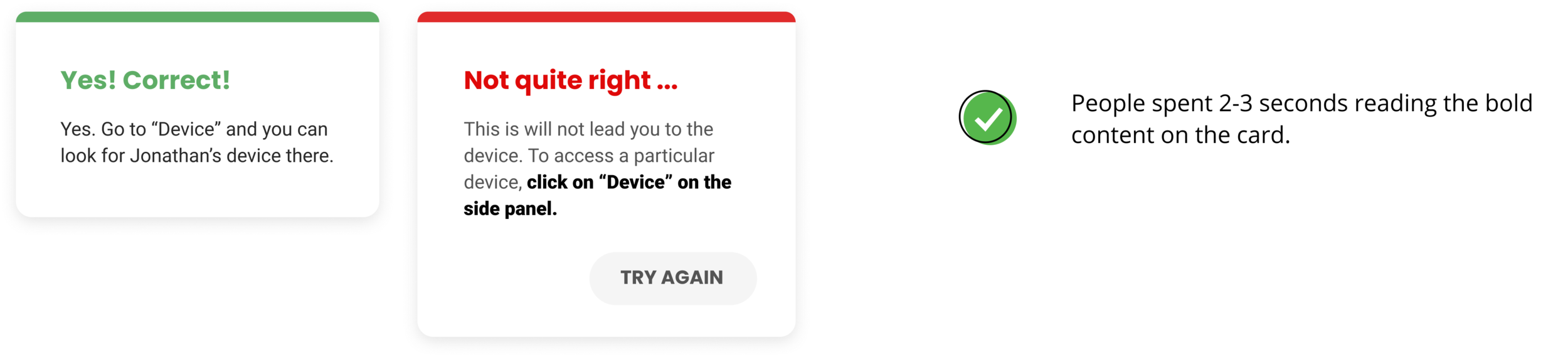
02. Feedback Card Iteration
Give instant feedback after each step to provide information about learning performance and actions to take.
We designed the feedback cards for each step to help the learners know how they performed and understand why it’s correct or how to approach to the correct actions.
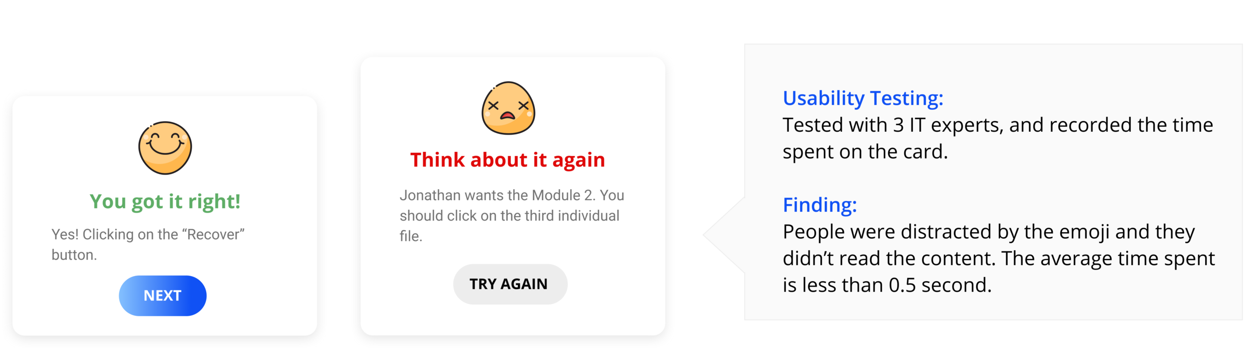
Iteration 1 : Feedback with colored title chunk
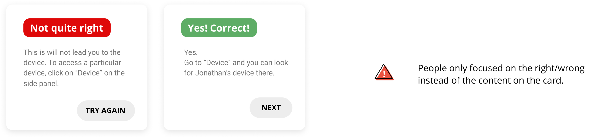
Final Iteration: Less emphasis on right/wrong, more focused on the feedback content
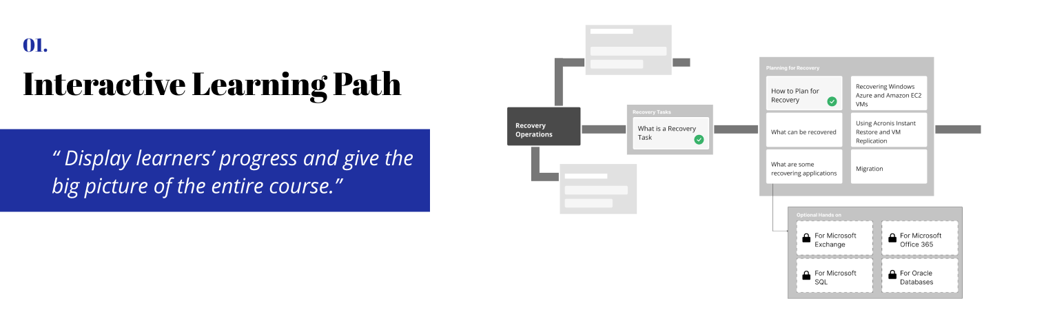
Designing hands-on activity required us to brainstorm not only the design but also how we would integrate it into the whole platform. We created information architecture and user flow. (Click to enlarge)
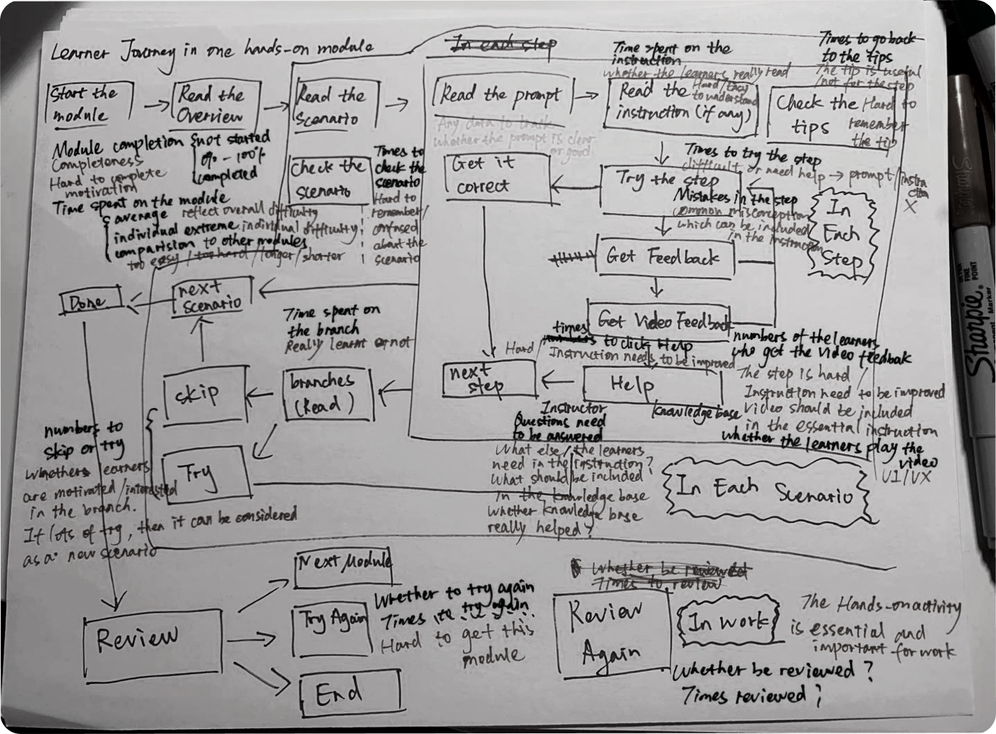
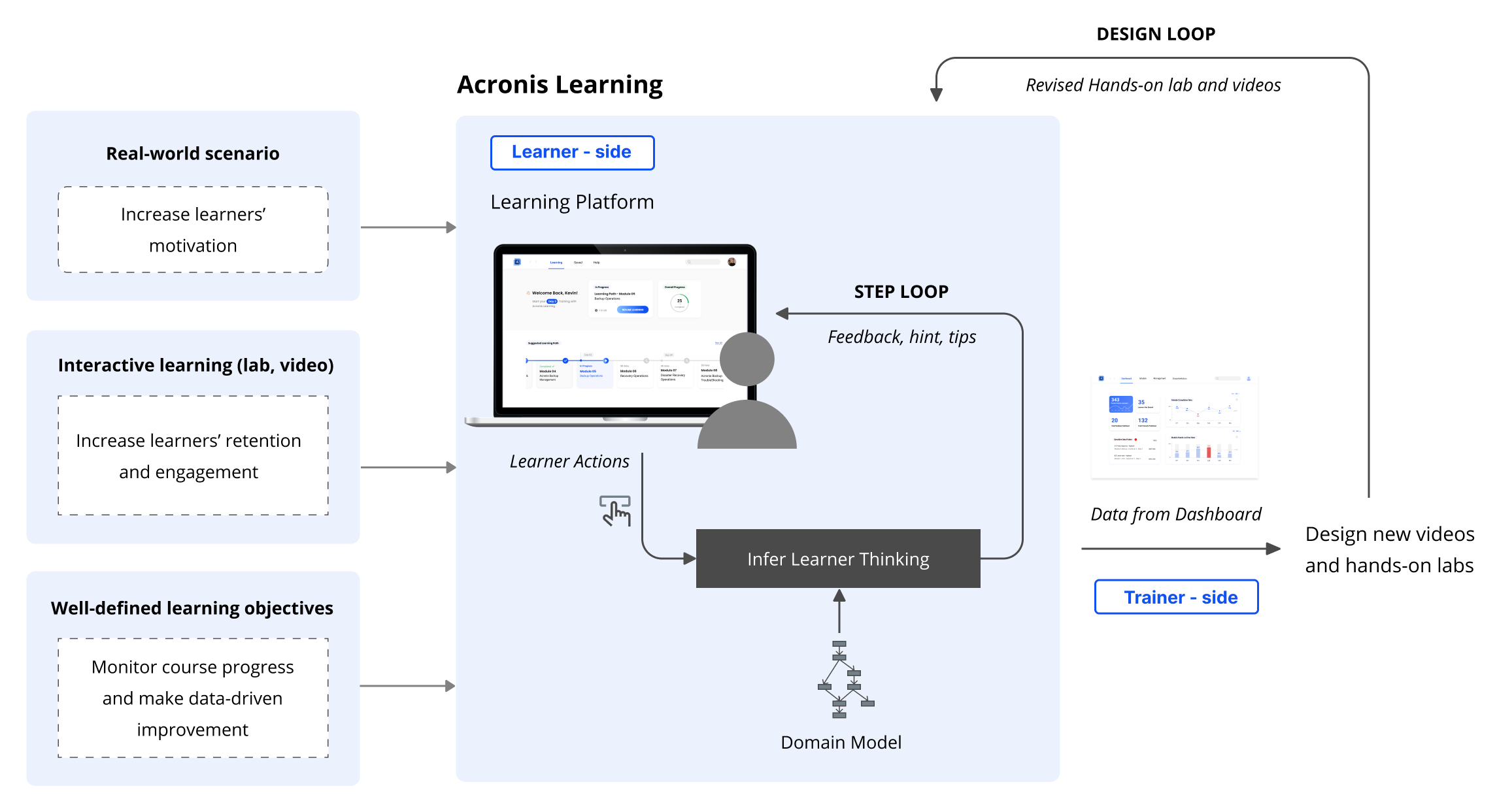
How the learning ecosystem we designed create continuous value?
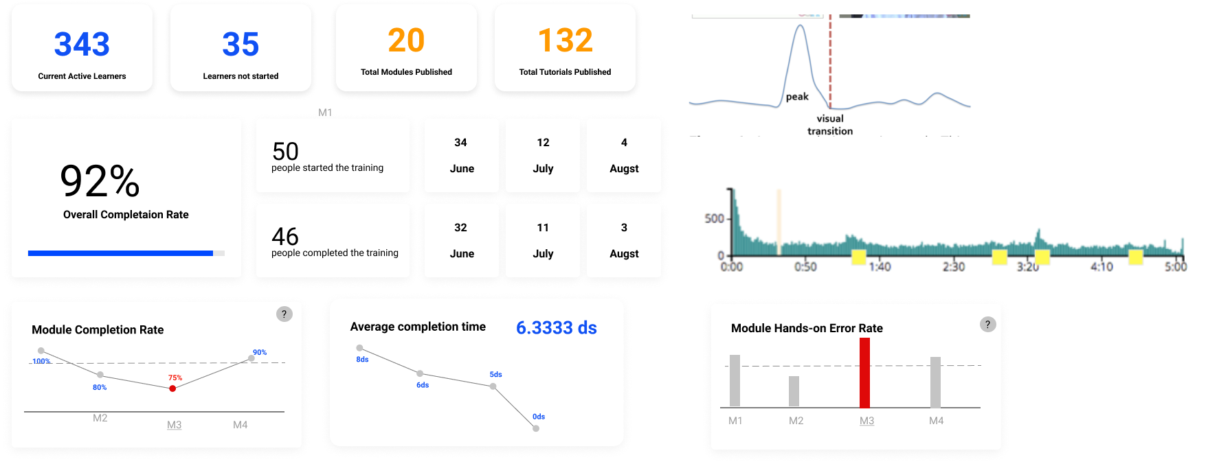
For every learner action, the system will infer learner thinking and give feedback, hints and tips for that step (step loop). After multiple learners have interacted with the system, data will be recorded by the platform which can be displayed in the dashboard to the trainer. The trainer can then make data-driven decisions to improve the Acronis training by revising the videos and hands-on lab (design loop).
Product Video
Evaluate User Experience
-Heuristic evaluation for specific tasks
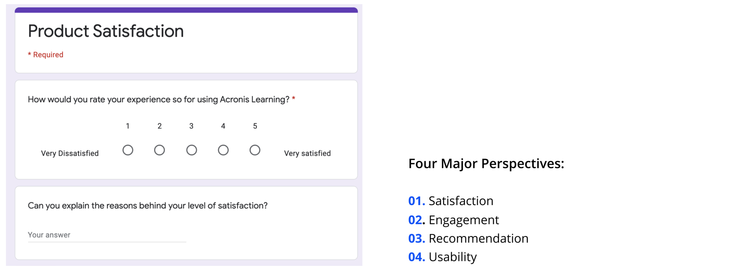
After we finalized our design throughout two round testing, we conducted final evaluation by letting the users and testers rate the usability and design for specific tasks and also evaluate the overall product experience from satisfaction, engagement and usability perspectives.
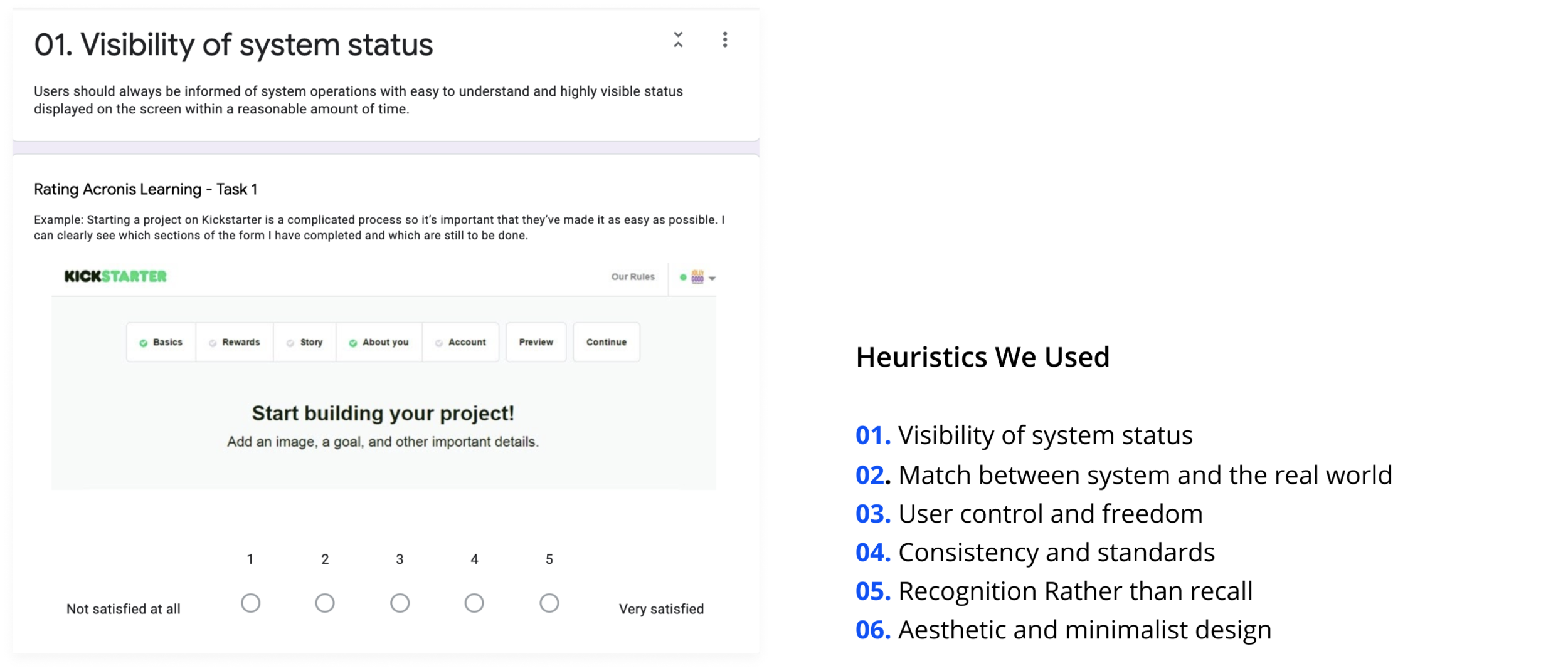
-Overall product experience evaluation
Communication with non-design background client
Our client didn’t know what to expect at the beginning and knew nothing about the design process. As a result, instead of just showing the deliverables, I learnt that it’s important to explain to them what does each step mean and why they are valuable.
Decide the design sequence of a complex platform under time-constraint
From the ideal journey map, we decided to create a learning platform for our clients. However, instead of starting from the big picture, we designed a detailed hands-on activity first. We spent many time testing and iterating this MVP. After finalizing the hands-on activity, we started to think about the big picture and MVP for trainers.
Design coordination
I collaborated with two other designers in our team and we used parallel design method. I learned how to convince other designers and better sell my ideas during the designers’ meeting.
Wearing more than the designer hat
Besides UX/UI designer, I also worked as a user research lead and front-end developer for our product website. I learned that how to see a problem from different perspectives.