
ROLE - UX Researcher & Designer
● Conduct interviews to find pain points
● Iterate based on usability testing
● Create wireframes and prototypes
TEAM
Individual Project
TIMELINE
1 month

*A few months after this redesign, Venmo updated the home page with a layout similar to my concept.

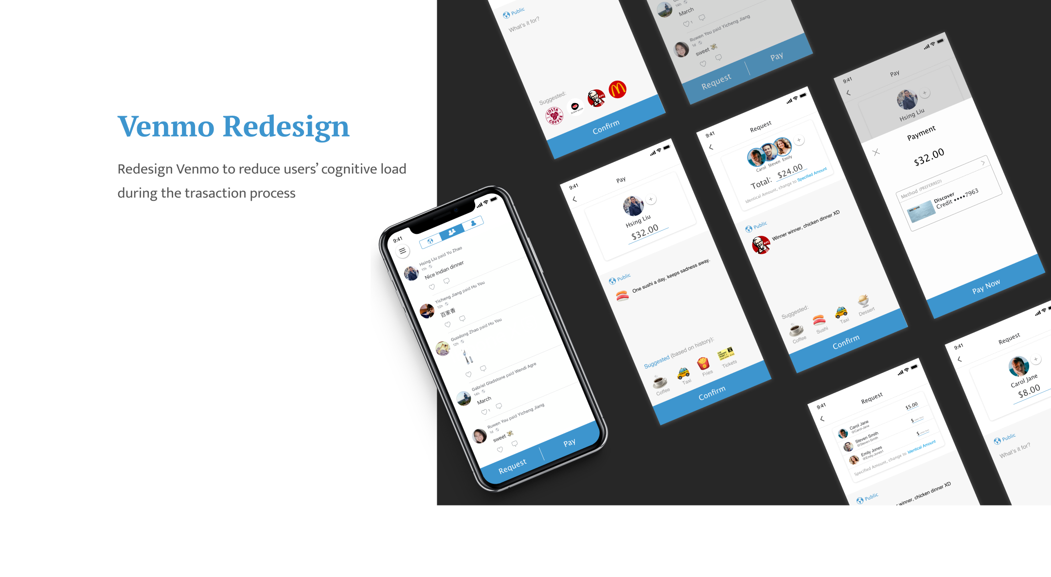
About Venmo
Venmo is a digital wallet that lets people make and share payments with friends. It is a mobile payment service owned by PayPal. Like Facebook, Instagram and WhatsApp, Venmo grew exponentially through peer-to-peer networking.
My Goal
Through researches, I found that Venmo requires a relatively large amount of cognitive processing capacity during the payment transaction process (pay, request, split).


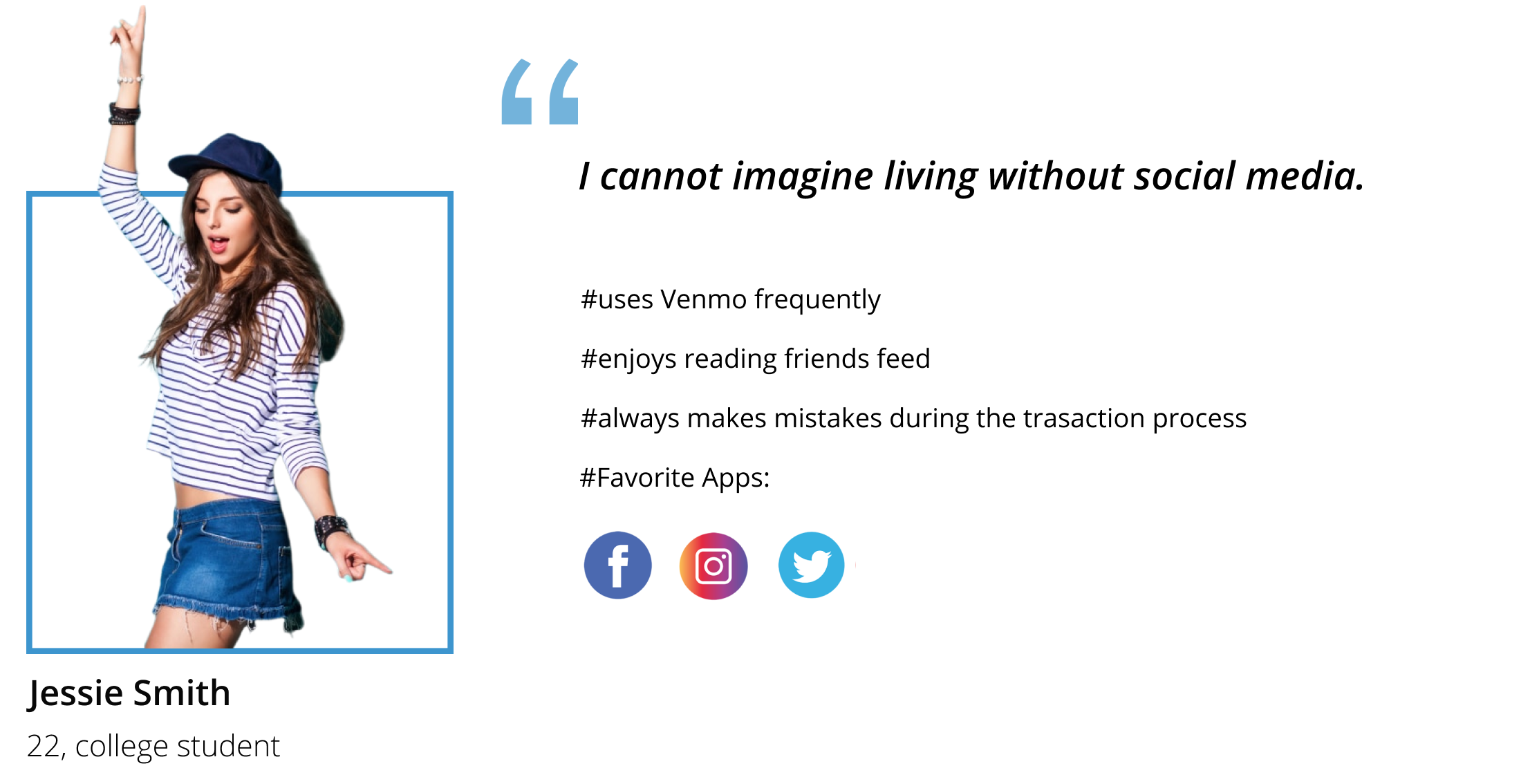
Jessie recalls her experience of using Venmo for the first time…
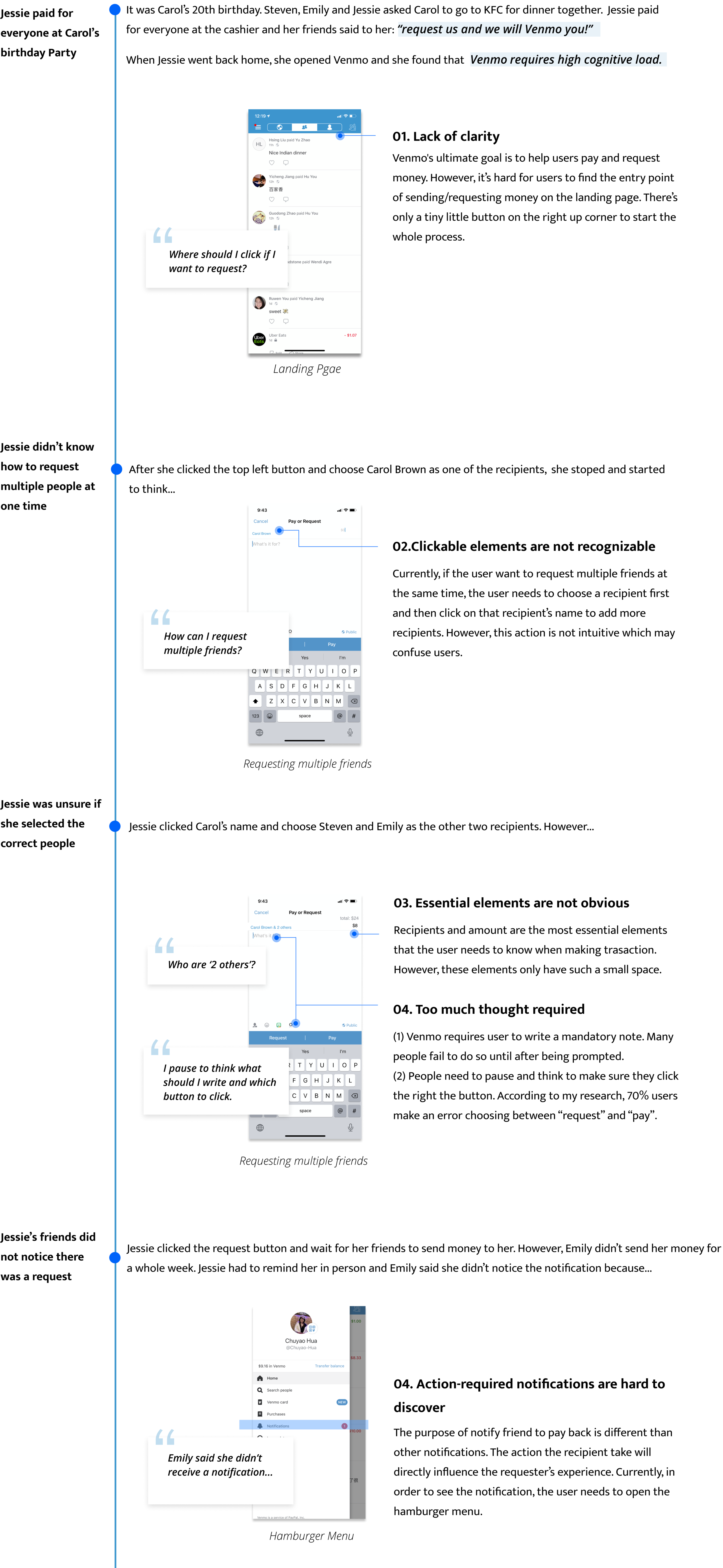


Cognitive load is the total mental effort it takes to process information related to reasoning and decision-making. Our working memory has a small capacity for holding the information our brain needs to process what’s going on. Any time the user has to stop and think while using the app, it increases their working memory and cognitive load. From Jessie’s experience, we can see that Venmo does require high cognitive load.
User testing for the key features
I brainstormed some key features that may help reducing the cognitive load: pay and request button on landing page, AI suggested notes, and no social interaction on the personal page, etc. I tested the ideas with 5 users using wireframes.
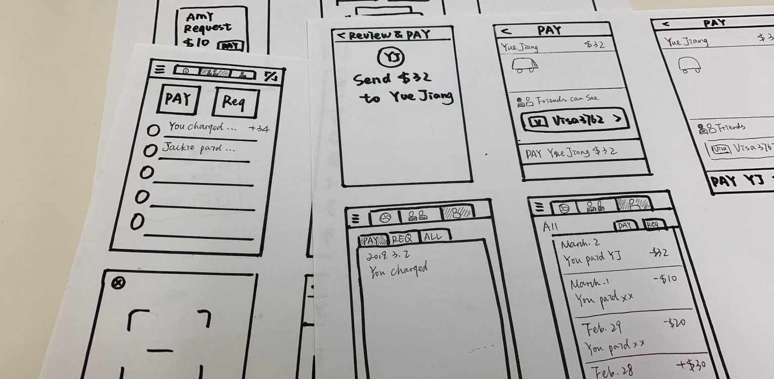
From the testing, I decided to go further with three main features:
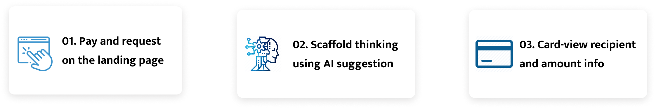
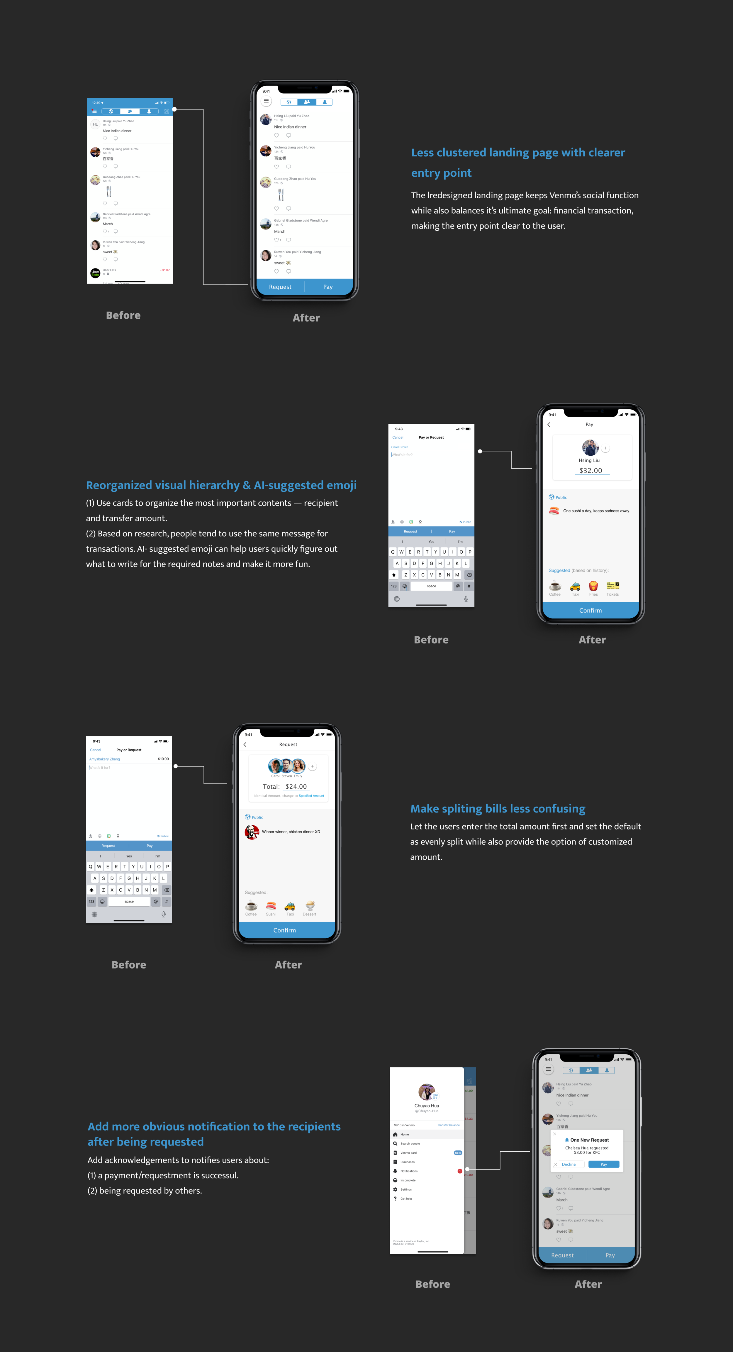
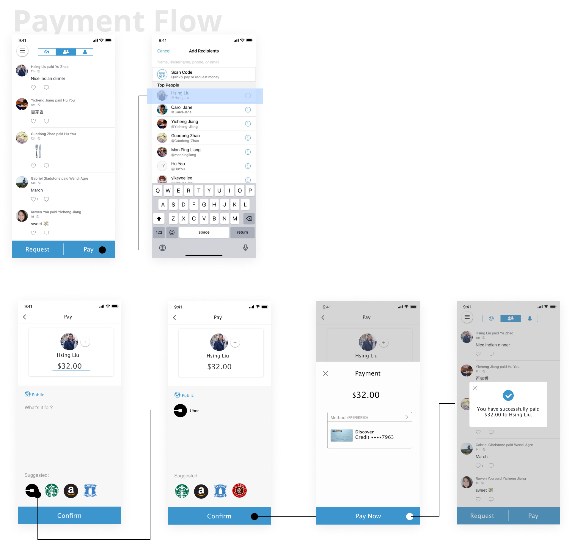
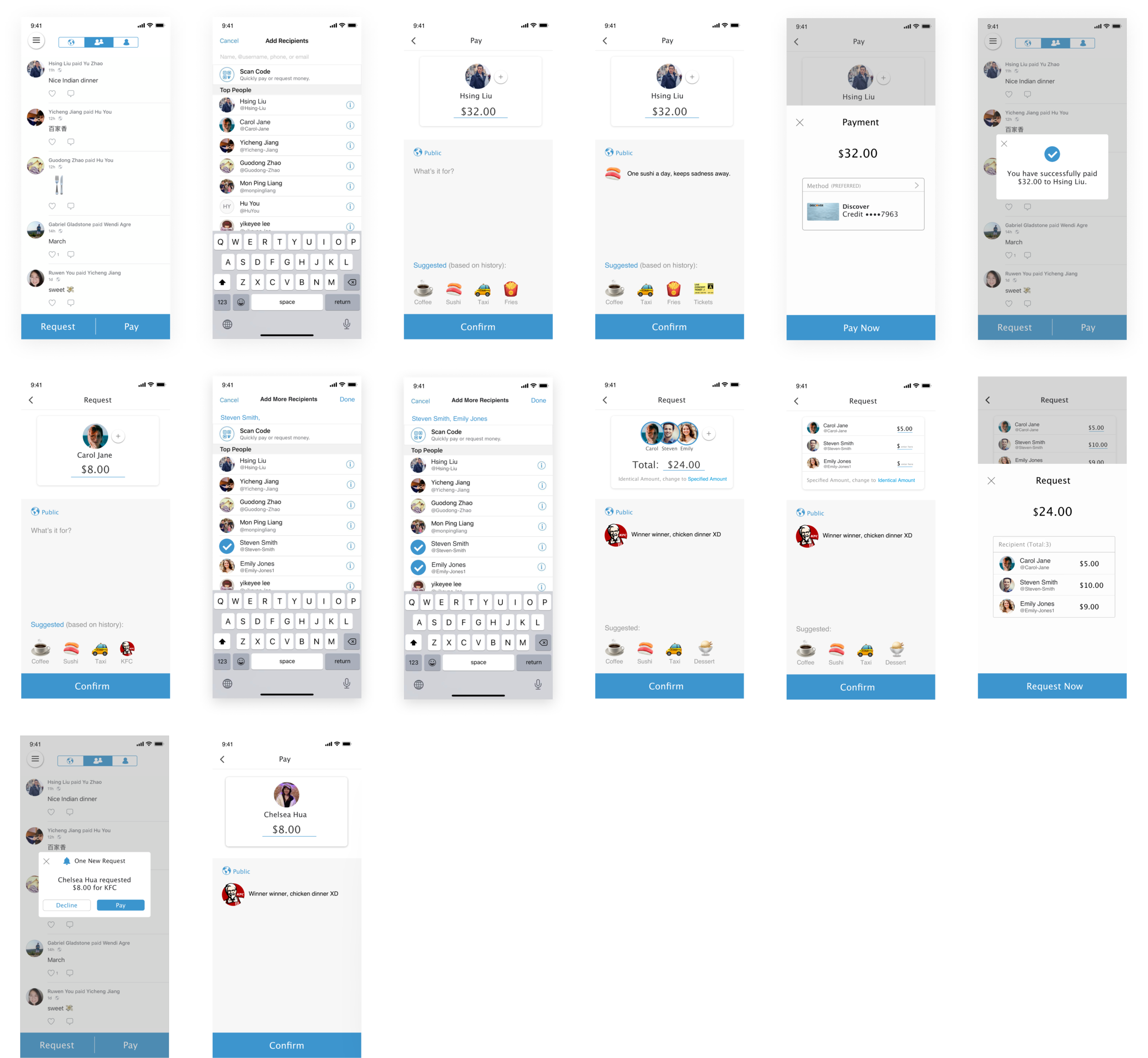
01. Pay and request button on the landing page
(1) Help users look for what they need as quickly as possible
(2) Make the buttons large to decrease interaction time
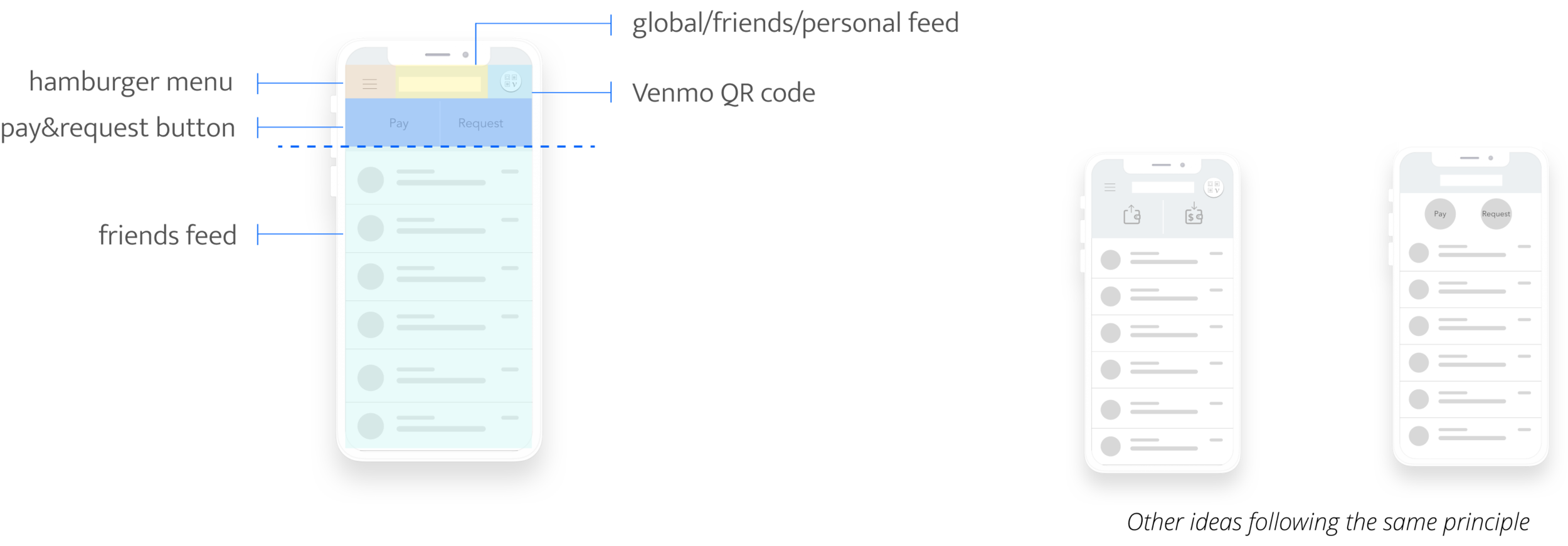
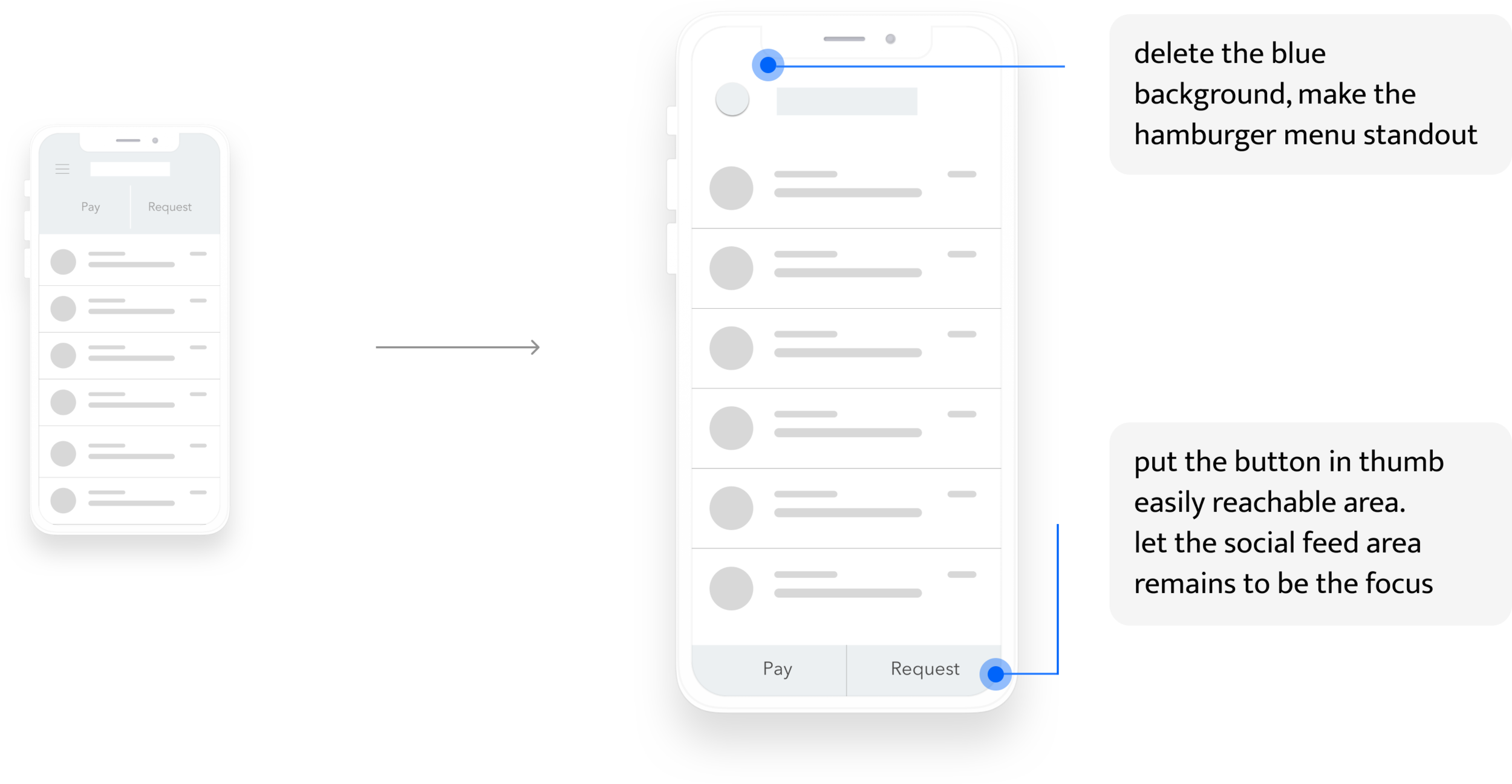
wait...the landing page is too clustered
The redesigned landing page has too many buttons on the top of the screen, this will...
(1) Disobey Hick’s law by giving users too many choices at the same place.
(2) Pay and Request buttons are above the social feeds, which will attract users’ attention and make the landing page to be action-focused. This may guide the users directly start the transaction without taking a look at the feeds.
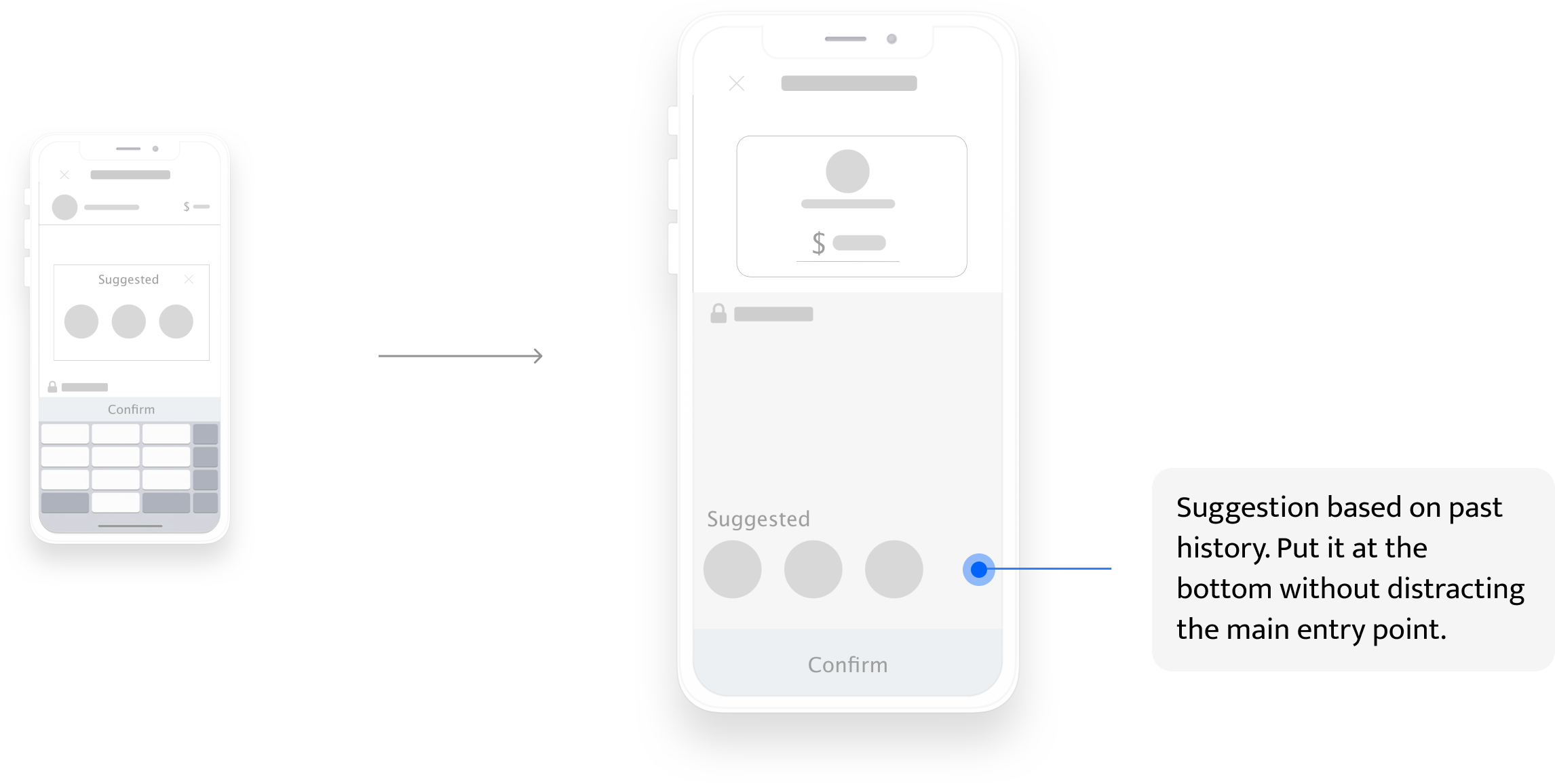
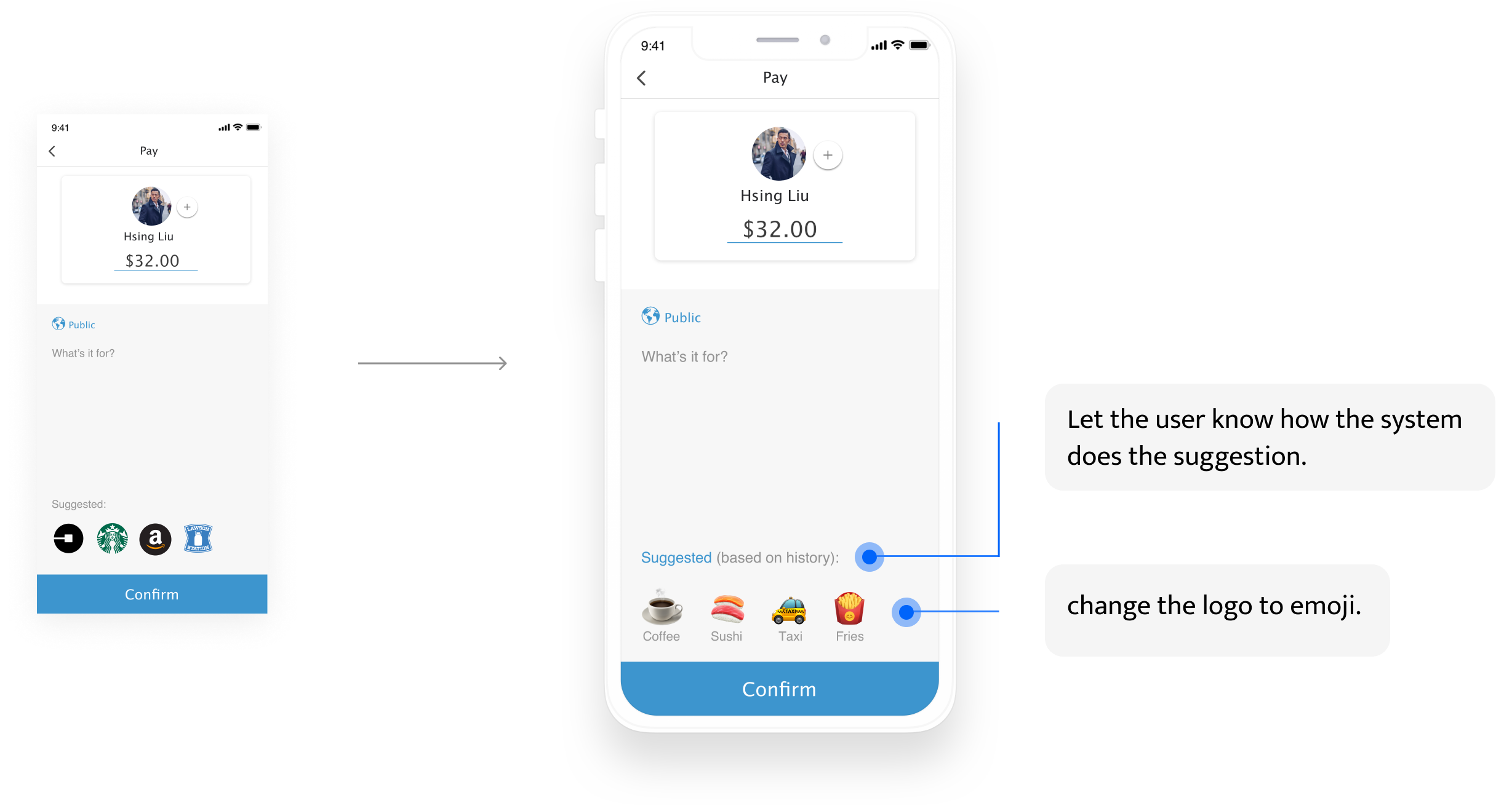
02. Scaffold thinking using AI suggestion
however...people don’t trust AI that much
From the user testing, I found that people don’t believe current technology can make correct prediction. If not, then the pop-up window will not be a benefit and in contrast, it will become a distraction. As a result, I redesigned the location.
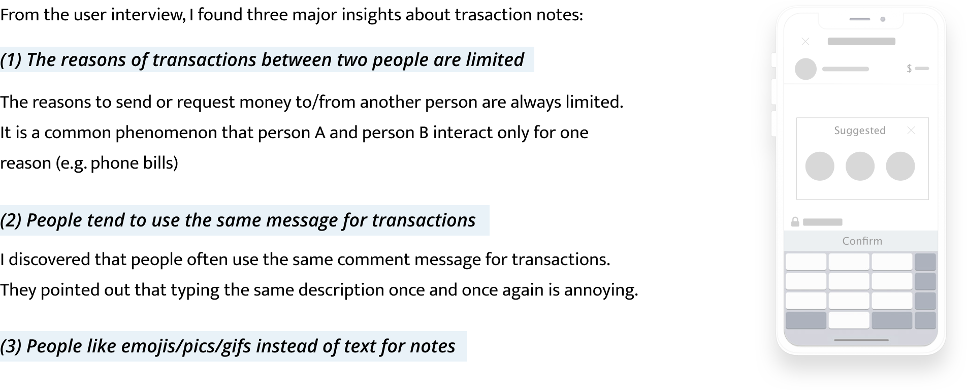
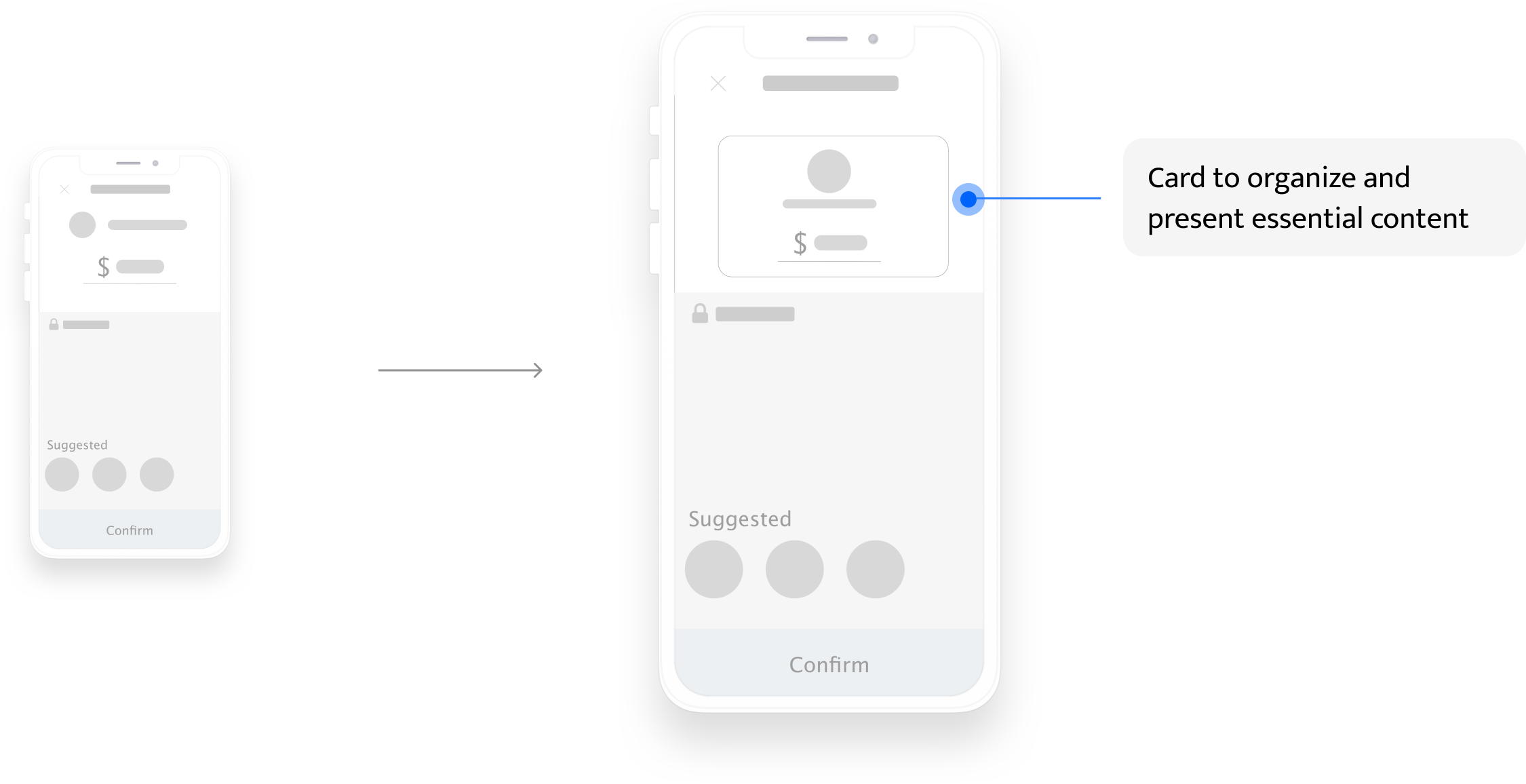
03. Card-view recipient and amount info
From the user interview, I found two major insights about presenting recipient and amount info:
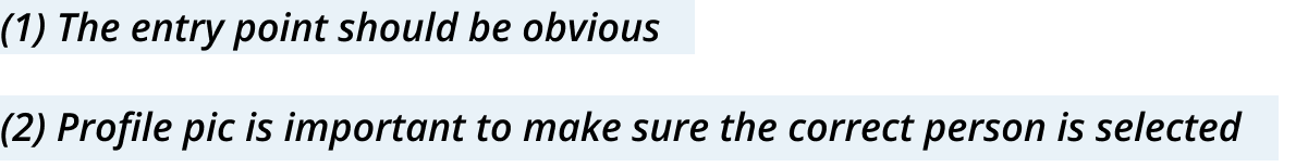
After user testing, I found that people will not treat the recipient and amount info as together visually. As a result, I choose to group the essential information to form one coherent piece of content.

Main iteration based on user testing
Main insights from user testing
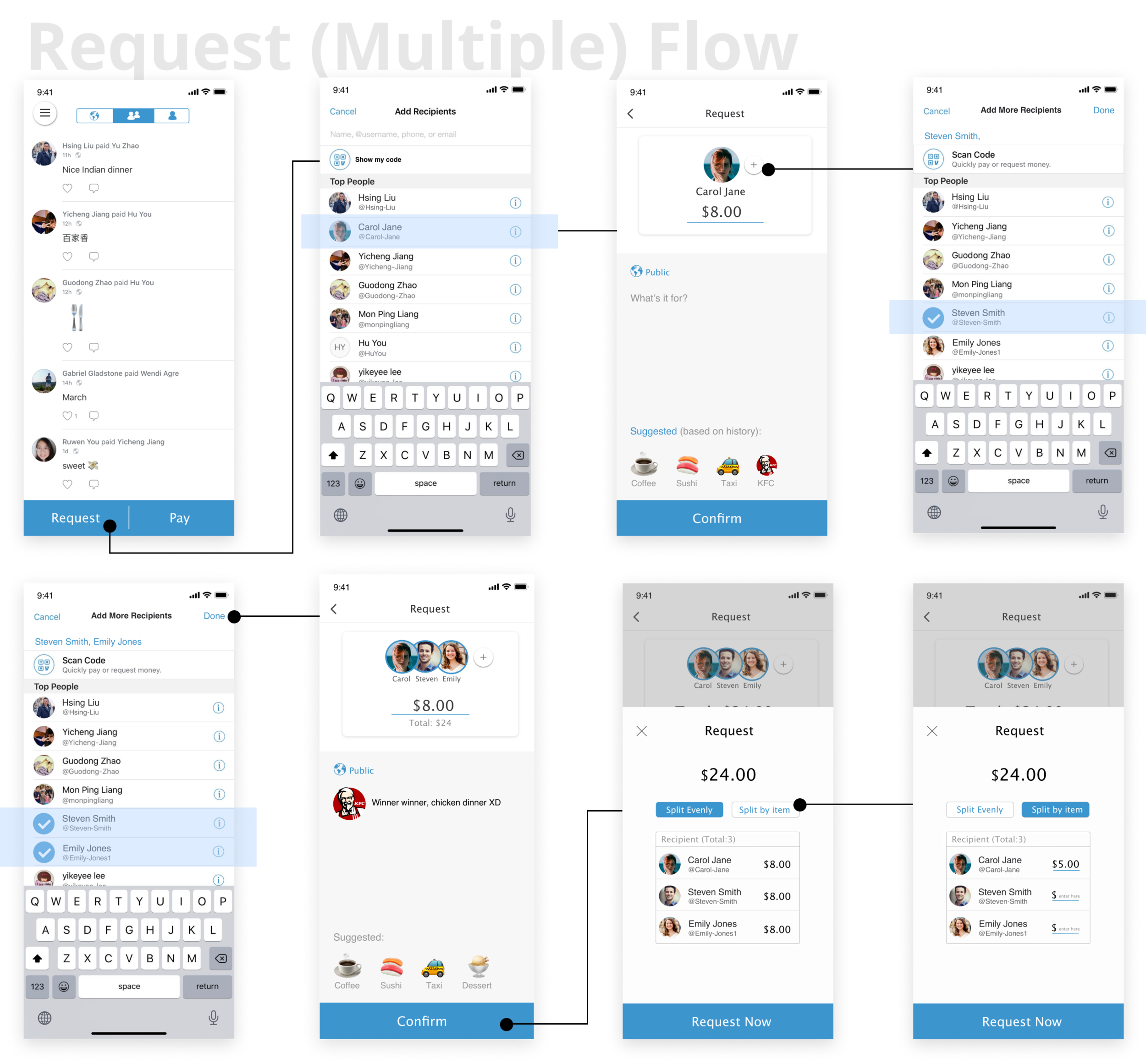
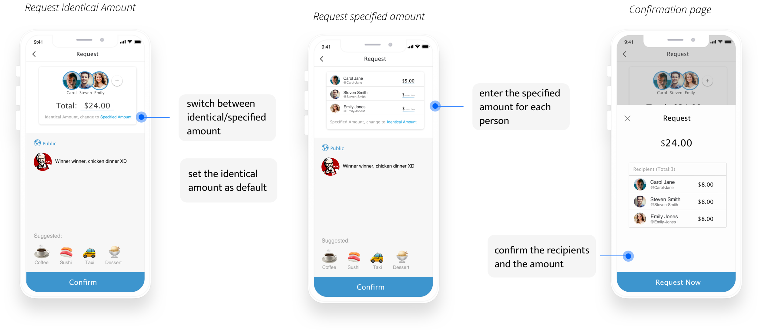
(1) It’s more nature to enter the total request number first and then choose how to split.
(2) The “request now” page should be the confirmation page. Users don’t expect to enter anything on this page.
Iterate on the flow and the UI elements
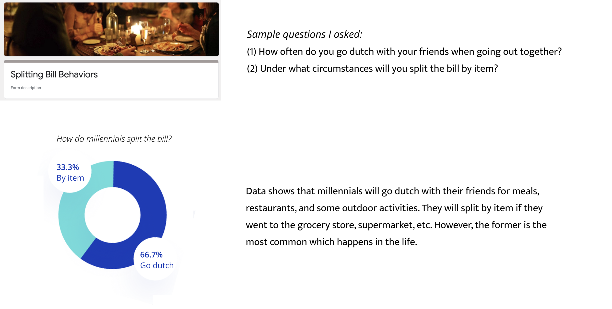
I created a quick survey to collect information about how do millennials split the bill. I mainly wanted to know often do they go dutch and under what circumstances do they split the bill by item or by person.


I learned a lot through this individual redesign experience. The way I present this work has a focus on storytelling and iteration, and I use the results from my user research to support this. I learned how to balance between how a company values itself and the real usability. I’m happy that I got a lot of positive feedback during the user testing. One of the user said to me that if Venmo can be this easy to use, he would be super delightful.
Moreover, I’m always trying to know more about the human brain and I believe that understanding cognitive load and how to manage it is a surefire way to improve the usability of a design.